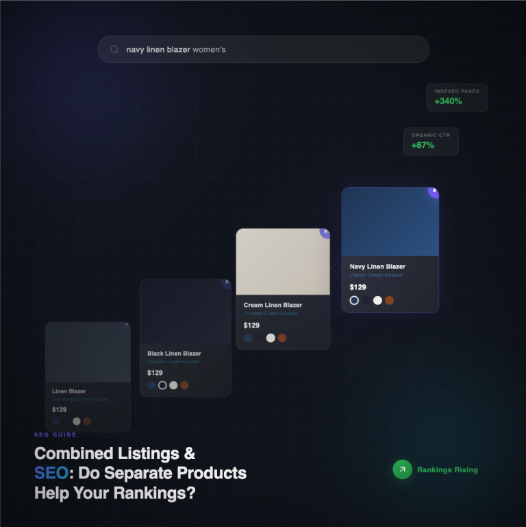
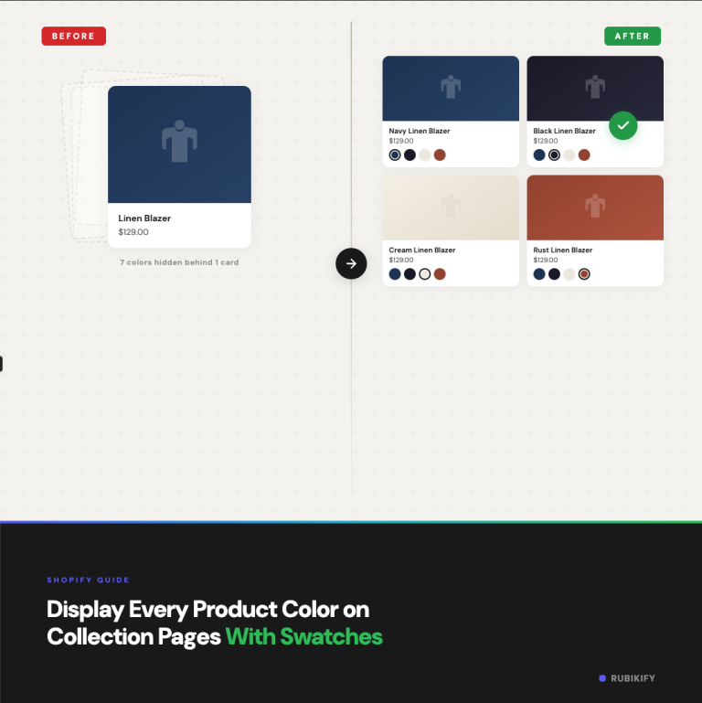
Your product pages might have beautiful color swatches, but if your collection page still shows one static thumbnail per product, customers are missing options before they even click through. Most Shopify themes don’t show variant swatches on collection grids by default. The customer sees a single product card, has no idea it comes in 8 colors, and scrolls past it.
Adding swatches to your collection page changes the browsing experience. Instead of clicking into every product to discover options, customers see all available colors at a glance. They can hover or click a swatch to preview what the product looks like in that color, directly from the collection grid. This is how major retailers like Zara, Nike, and H&M display products, and the reason is simple: it works.
This guide covers how to add collection page swatches to any Shopify theme, the different approaches available, and the setup details.
Why Collection Page Swatches Matter
Collection pages are where most browsing happens. A customer lands on your “Hoodies” collection and sees a grid of 24 products. Without swatches, they see 24 thumbnails. With swatches, they see 24 thumbnails plus 5-10 color options each, and they can preview each color without leaving the page.
The impact shows up in several places:
More products get discovered. If your navy hoodie’s thumbnail shows the black version, customers looking for navy might skip it entirely. A color swatch row reveals that the navy option exists without requiring a click.
Fewer back-and-forth clicks. Without collection swatches, the customer clicks a product, checks the colors, goes back, clicks the next one, checks colors, goes back. Each round trip adds friction and increases the chance they leave. Swatches collapse that process into one scan of the grid.
Higher perceived selection. A grid of 24 products with 6 swatches each communicates “we have 144 options” even if the customer doesn’t do the math. It signals that you have depth and variety, which builds confidence that they’ll find what they want.
Mobile browsing gets faster. On phones, going back to a collection from a product page often reloads the grid and loses scroll position. Swatches let mobile shoppers browse colors without ever leaving the collection, which is why this matters even more on mobile than desktop.
The Three Approaches
There are three ways to get swatches on your collection page, each with different tradeoffs.
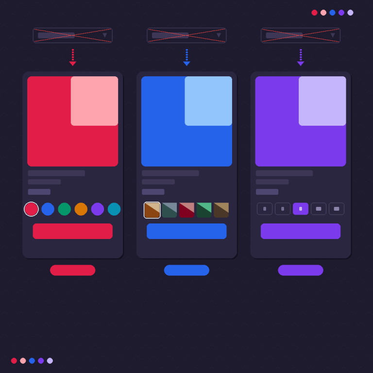
1. Theme-Native Swatches (Limited)
Some newer Shopify themes include built-in collection page swatches. Dawn (Shopify’s free default theme) added basic swatch support in recent versions. A few premium themes from the Shopify Theme Store also include it.
Pros: No app needed. Native performance. Matches your theme’s design automatically.
Cons: Only works with Shopify’s variant system (not separate products connected as combined listings). Usually limited to color dot swatches with no image swatch option. Customization is minimal. If your theme doesn’t have it, you’d need to switch themes or edit Liquid code.
Best for: Stores on Dawn or a compatible theme with simple variant-based products and no need for image swatches or combined listings.
2. Custom Liquid Code
You can edit your theme’s collection template to render swatches by looping through each product’s variant options and displaying a swatch for each color value. This requires knowledge of Shopify’s Liquid template language and typically involves modifying collection-product-card.liquid or its equivalent in your theme.
Pros: Full control over design and behavior. No ongoing app costs.
Cons: Requires developer skills. Theme updates can break your customizations. Only works with native Shopify variants (not combined listings). You have to build the hover-preview, mobile responsiveness, and out-of-stock styling yourself. Maintenance burden is ongoing.
Best for: Stores with an in-house developer or agency on retainer who can maintain custom code.
3. Combined Listings App With Collection Swatches
This is the approach that works with any theme and any product structure. A combined listings app like Rubik Combined Listings injects swatches into your collection grid using app embeds. The swatches connect separate products, so each swatch links to a different product with its own URL, images, and description.
Pros: Works with any OS 2.0 theme. Supports separate products (not just variants). Image swatches, color swatches, and buttons available. Out-of-stock styling built in. No code editing needed. Mobile-responsive by default.
Cons: Requires an app subscription. Adds a small JavaScript footprint.
Best for: Most stores, especially those using separate products for different colors/materials, or stores that want image swatches and out-of-stock handling without touching code.
Setting Up Collection Page Swatches With Rubik Combined Listings
Here’s the step-by-step process. If you haven’t created your product groups yet, start with our guide on how to show separate products as color swatches first, then come back here for the collection page setup.
Step 1: Install and Activate
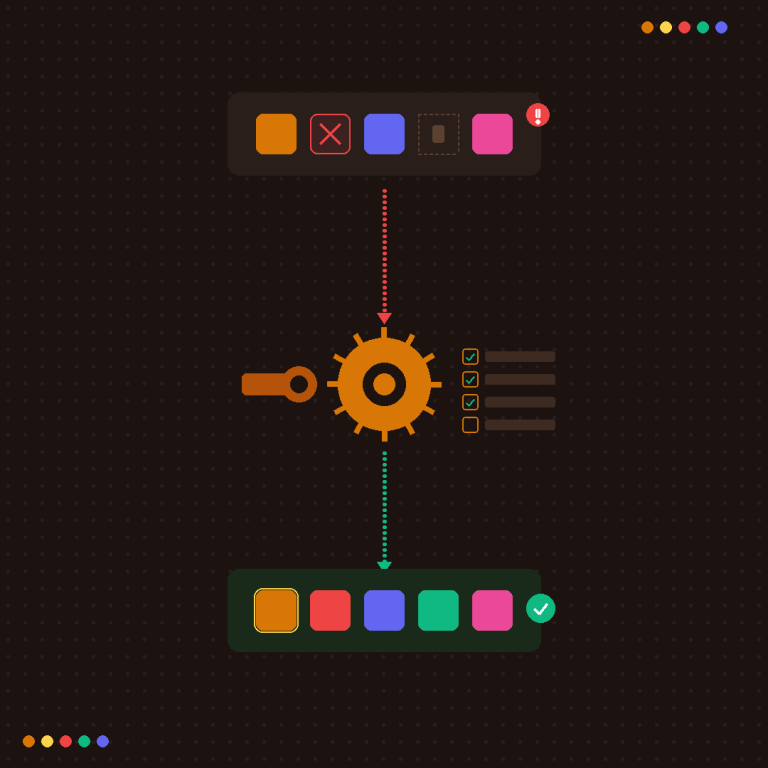
Install Rubik Combined Listings from the Shopify App Store. Go to your theme’s App Embeds section and toggle the Rubik embed on. Select your theme type so the app knows where to inject swatches on product cards.
Step 2: Create Product Groups
If you haven’t already, create product groups for each set of connected products. Select the products, set the option name (like “Color” or “Material”), and assign option values. Use Magic Fill to auto-detect values from your product titles and auto-assign colors from product images.
Step 3: Enable Collection Page Swatches
In the app settings, find the collection page section. Enable swatches for product cards. Choose between:
- App embed injection: The app automatically finds product cards on your collection page and adds swatches below each one. Works with any theme.
- App block placement: If your theme supports app blocks in the product card template, you can place the swatch block exactly where you want it in the card layout.
Step 4: Choose Swatch Type and Style
Pick the swatch type that fits your product. Color swatches work for solid colors. Image swatches work for patterns, fabrics, and materials. Button swatches work for text-based options like sizes or styles.
Select a style preset as a starting point. You can adjust swatch size, shape (circle or rounded square), spacing, border styles, and selection indicator separately for desktop and mobile.
Step 5: Configure Mobile Behavior
On mobile, collection grids are typically 2 columns. Swatch rows need to be compact enough to fit under the product image without pushing the card height too much. The app lets you set a different swatch size and maximum visible swatches for mobile. If a product has 12 colors, you might show 6 on mobile with a “+6” overflow indicator.
Step 6: Preview and Test
Open your collection page in a preview. Check that:
- Swatches appear under each product card
- Clicking a swatch takes the customer to the correct product page
- Out-of-stock products show the correct styling (crossed out, dimmed, or hidden based on your settings)
- The swatch row doesn’t break the grid layout on mobile
For a live example, browse the collection pages on the demo store.
The knowledge base has detailed articles for each step, and there’s a video tutorial on YouTube showing the full process including collection page setup.
Collection Swatch Design Tips
Keep swatches small on collection pages. Product page swatches can be large and detailed. Collection page swatches should be compact: 20-28px for color dots, 28-36px for image swatches. The product card is already doing heavy lifting with its thumbnail and title. Swatches are supplementary information, not the star.
Limit the visible count. If a product has 20 colors, showing all 20 swatches under a collection card creates visual noise. Show the first 5-8 and add a “+12 more” counter. The customer gets the message that more options exist and clicks through to see them all.
Use consistent swatch types across your collection. If some products show color dots and others show image thumbnails, the collection grid looks inconsistent. Pick one style per collection or per product type and stick with it.
Test on real devices. The collection grid is where mobile layout issues show up most. A swatch row that looks fine on desktop can push product cards out of alignment on a phone. Always test on an actual phone, not just browser device simulation.
Mind the fold. On mobile, customers see 2-4 products above the fold. If your swatches add 30px of height per card, that’s one fewer product visible in the initial viewport. Keep swatch height minimal so more products are visible without scrolling.
How Collection Swatches Work With Different Product Structures
Your product structure determines which kind of collection swatch you need:
Variant-based products (one product with multiple variants): Theme-native swatches or custom code can handle this. Each swatch represents a variant of the same product. Clicking a swatch might update the card thumbnail but keeps the customer on the same product URL.
Separate products connected by a combined listings app: Each swatch represents a different Shopify product. Clicking a swatch navigates to that product’s page (with its own URL, images, and SEO value). This is what Rubik Combined Listings provides.
Mixed setups (some products use variants, some use combined listings): This is more common than you’d think. Your t-shirts might use variants for sizes and combined listings for colors. The app handles both: it shows combined listing swatches on products that have groups, and leaves other products untouched.
If your store also uses variant-level image galleries on individual products (showing only the selected variant’s photos), Rubik Variant Images (5.0★, 316+ reviews, Built for Shopify) handles that within-product image filtering. More details at rubikvariantimages.com.
Theme Compatibility
Collection page swatches have the widest theme compatibility gap of any swatch feature. Here’s the reality:
Dawn and Shopify free themes: Work well with both app embed injection and app blocks. Dawn’s updated versions have good product card structure that apps can hook into.
Popular paid themes (Prestige, Impulse, Warehouse, Symmetry, etc.): Most work with app embed injection. Some support app blocks in product cards, which gives more layout control.
Custom-built themes: Usually work with app embed injection, though the exact positioning of swatches might need CSS adjustments. The app’s theme type selector helps, but fully custom themes may require minor tweaks.
Vintage (non-OS 2.0) themes: These don’t support app embeds or blocks. Collection page swatches typically require script tag injection and are less reliable.
If you’re not sure about your theme, test on a duplicate theme first. Install the app, enable collection swatches, and preview before applying to your live theme.
FAQ
Combined listings apps load swatch data after the initial page render, so the core collection grid loads first and swatches appear shortly after. The overhead is typically a few kilobytes of JavaScript and CSS. If your collection has 100+ products per page, consider paginating or using infinite scroll to limit the number of swatches rendered at once.
Yes, if you use an app that supports it. Rubik Combined Listings supports both color swatches and image swatches on collection pages. Image swatches are especially useful for products where color alone doesn’t communicate the option (like patterned fabrics, wood grains, or multi-color prints).
Combined listings apps work alongside Shopify’s native collection filtering. The swatches are a display feature, not a filter feature. Your existing color, size, and price filters continue to work as normal. The swatches add visual browsing on top of that.
For most stores, 5-8 is the sweet spot. Enough to show variety, compact enough to not overwhelm the card. Products with more options get an overflow counter (“+4 more”). On mobile, reduce to 4-6 visible swatches.
They’re typically part of the same app but configured separately. You might want larger swatches on the product page and compact ones on the collection grid. Rubik Combined Listings lets you set different swatch sizes, types, and behaviors for product pages vs. collection pages.
Need to identify which theme a store is using? Try our theme ID finder tool.
Getting Started
If your collection pages aren’t showing swatches yet, here’s the quickest path:
- Install Rubik Combined Listings and create your product groups
- Enable collection page swatches in the app settings
- Pick a swatch type and adjust the style for your grid
- Test on desktop and mobile
- Go live
For stores that already have product page swatches set up, enabling collection swatches is a single toggle. The groups and styles you already configured carry over to the collection grid.
Browse the demo store collection pages to see what it looks like before setting up your own.
For more on structuring your product catalog and optimizing collection pages, the CraftShift blog covers Shopify storefront design decisions in depth.
Useful Links: Rubik Combined Listings · Rubik Variant Images · Live Demo Store · Knowledge Base · YouTube Tutorial · RubikVariantImages.com · CraftShift Blog · Shopify Theme Store · Shopify Variant Apps