We built Rubik Combined Listings to solve a specific gap in Shopify. Stores that sell products in multiple colors, materials, or styles often need each option as its own product – for SEO, for variant limit reasons, or because their supplier workflow creates them that way. But Shopify gives you no built-in way to visually connect those products on the storefront. A customer looking at your navy jacket has no idea the same jacket exists in cream and black.
This post walks through everything the app does, from the swatch types to collection page rendering, Magic Fill automation, out-of-stock handling, mobile styling, and the features that separate it from Shopify’s native combined listings tool.
The Core Idea
You create product groups in the app dashboard. Each group contains products that are related – typically different colors of the same item, but it could be materials, fabrics, scents, patterns, or any attribute.
Once grouped, two things happen on your storefront:
Product pages get a swatch row. It renders right where Shopify’s native variant selector sits – above the Add to Cart button. Customers click a swatch, they land on that product’s page with its own images, price, inventory, and description. The position and interaction pattern are identical to picking a standard Shopify variant. No one realizes these are separate products.
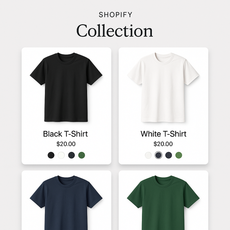
Collection cards get swatch indicators. Small dots, circles, or thumbnails below each product card’s image. Hover over one and the card’s thumbnail swaps to preview that product. Click to go directly to its page. Every color in the group is visible and accessible right from the collection grid.
Both layers are independently configurable. You can style product page swatches completely differently from collection card swatches. Desktop and mobile settings are separate too.
Four Swatch Types
Each product group can use a different swatch type. You pick what fits the product category.
Color Swatches
Solid color circles or squares. The most common choice for apparel, accessories, and anything defined by color. Two features worth noting:
Two-tone colors. Some products have dual-color designs – a hoodie with a navy body and cream sleeves. Two-tone swatches split the circle with two colors. Three split directions: vertical, horizontal, and diagonal. This avoids the “which color do I pick to represent this?” problem.
Eyedropper tool. Instead of guessing hex codes, click the eyedropper on a product photo and the app samples the exact color. Faster than looking up hex values, and the swatch matches the actual product photo.
Image Swatches
A small photo or texture preview inside the swatch circle. Five image source options: first product image, second image, last image, custom upload, or auto mode (tries custom image first, falls back to product photo).
This exists because some products can’t be represented by a flat color. A herringbone fabric, a marble countertop finish, a floral print phone case. Showing the actual texture communicates the option far better than a solid gray circle.
Button Swatches
Text labels inside clickable rectangles. Optionally include a small image next to the text. Can display price inside the button.
We added these because not every product axis is visual. “iPhone 15” vs “iPhone 16” doesn’t have a color. “50ml” vs “100ml” doesn’t have a texture. Text does the job. Showing the price inside the button works well for options where pricing varies significantly – like gold vs silver jewelry.
Dropdown
A standard select menu. Minimal space footprint. Out-of-stock products automatically append “(Sold out)” to the option text.
Best for groups with 20+ products where showing individual swatches would overwhelm the page. We see this most with stores selling paint colors, fabric samples, or specialty items with dozens of options.
Detailed comparison with product category examples: How to Display Product Variants as Swatches on Shopify
Collection Page Swatches
This is the feature that most differentiates Rubik from simpler combined listings tools. It’s not just product page swatches – the connection extends to your collection grid.
Hover image swap. When a customer hovers over a swatch on a product card, the card thumbnail changes to that product’s photo. No page load, no popup. Resolution is configurable from 300px to 2000px so you can balance image quality and load speed.
Overflow control. Two options keep the card layout clean when groups have many colors. “Limit to one row” keeps swatches in a single horizontal line with a “+N more” indicator. “Max visible” sets a hard cap.
Separate mobile settings. A 22px swatch works on desktop but is too small for a thumb tap on a phone. Set 22px for desktop and 36px for mobile independently. Apple recommends minimum 44px for touch targets, and we’ve found 32-40px is the sweet spot for swatch dots on collection cards.
App Blocks option. The default app embed injects swatches via JavaScript after page load. For stores with heavy collection pages (50+ products visible), App Blocks render swatches inline with the page HTML. Slightly faster initial render on large grids.
Complete collection page walkthrough: How to Add Color Swatches to Shopify Collection Pages
Magic Fill for Large Catalogs
Manually creating groups, adding products, and picking hex colors works fine for 10-20 products. At 200+, it becomes a project. Magic Fill automates the tedious parts.
It analyzes product images to detect dominant colors and generates swatch colors automatically. It reads product titles to extract option labels (“Navy,” “Cream,” “Burgundy” from “Linen Blazer – Navy”). For print-on-demand stores that import 500 products at a time, this compresses setup from hours to minutes.
A paint store with 800 colors told us Magic Fill turned what they estimated as a weekend-long data entry project into something they finished during a lunch break.
Out-of-Stock Behavior
Three display modes when a product in a group sells out:
Hidden. Swatch disappears entirely. Customers only see available options.
Pushed to end. Available products first, sold-out ones at the back of the row. Customer sees everything but available options are prominent.
Styled differently. Reduced opacity (configurable from 0.1 to 1.0) with an optional diagonal strikethrough line. Line color and opacity are separately adjustable.
Dropdown swatches add “(Sold out)” to the option text automatically.
Archived products auto-hide regardless of the setting. If you archive a discontinued color in your Shopify admin, its swatch disappears from every group it belongs to.
Multi-Group, Categories, and Carousel
Multi-group. A product can belong to more than one group simultaneously. A jacket might be in a “Color” group (color swatches showing navy/black/cream) and a “Material” group (image swatches showing cotton/linen/wool textures). Both swatch rows render on the product page.
Categories. Products within a group can be organized into sub-categories. A “Living Room” group with categories for “Sofas,” “Armchairs,” and “Coffee Tables.” Each category gets its own labeled swatch section on the page.
Carousel. For groups with 15+ products, swatch rows can scroll horizontally. Arrow navigation, smooth scrolling, configurable scroll speed. Prevents the swatch area from taking over the product page layout.
20+ Visual Presets and 70+ CSS Variables
Starting from scratch is optional. Twenty design presets cover the most common layouts: compact circles, squares, rounded rectangles, pills, buttons with text, buttons with images, multi-row grids, single-row carousels. Pick the closest match to your store’s aesthetic and adjust from there.
For stores with specific design requirements, 70+ CSS variables expose every visual property: swatch size, border radius, gap spacing, selected state border, hover opacity, label font size, overflow indicator styling, and more. Your developer (or you, if you’re comfortable with CSS) can match any design system.
Theme Compatibility
Every theme in the Shopify Theme Store is supported. Dawn, Refresh, Impulse, Prestige, Symmetry, Warehouse, Focal, Sense, Craft, Pipeline – all of them. Custom themes work too. Page builders (PageFly, GemPages, EComposer) are supported.
The app detects where your theme places the variant selector and injects swatches in the same position. If swatches appear in the wrong spot, the most common fix is selecting the correct theme type in the app embed settings.
Theme compatibility issues are covered in: Shopify Color Swatches Not Working? Troubleshooting Guide
How It Stacks Up Against Shopify’s Native Feature
Shopify released a native Combined Listings app in 2024, but it requires a Plus plan ($2,300+/month). Rubik works on Basic ($39/month) and includes features the native app doesn’t offer: collection page swatches with hover preview, image swatches, button swatches, dropdown swatches, two-tone colors, Magic Fill, separate desktop/mobile styling, categories, carousel layout, and 70+ CSS variables.
Full comparison: Native vs Third-Party Combined Listings Apps
Without Plus setup guide: How to Create Combined Listings on Shopify Without Plus
Works Alongside Rubik Variant Images
Rubik Variant Images handles a different problem: filtering the image gallery when a variant is selected within a single product. Pick “Size M” and only see medium-specific photos.
Combined Listings handles between-product navigation. Variant Images handles within-product gallery filtering. Same team, no conflicts, designed to run side by side.
Full dual-app walkthrough: Show Every Color on Your Collection Page (And the Right Photos When They Click)
Getting Started
Demo store: combinedlistings.rubikdemo.com – see everything working on a real storefront.
Video tutorial: YouTube
Install: Rubik Combined Listings (free plan available)
Docs: Knowledge Base
Related: Shopify’s Variant Limit and How to Get Around It · Combined Listings and SEO · Separate Products vs Variants · CraftShift.com · RubikVariantImages.com