Shopify collection pages show one card per product. If your jacket comes in 10 colors and those colors are variants under one product, the grid shows one jacket card. The other 9 colors are invisible unless someone clicks into the product and manually flips through variant options.
If you’ve been searching for how to show all variants on Shopify collection pages, how to add color swatches to your Shopify collection grid, or why your Shopify collection only displays one image per product, you’re dealing with this core limitation.
The fix: make each color a separate product and connect them with a combined listings app. Your collection grid shows every color as its own card, each card gets swatch indicators linking all siblings, and hovering a swatch previews that color’s image right on the grid. On the product page, a full swatch row acts as a variant-style selector so customers can switch colors without going back to the collection.
This post walks through exactly how to set this up using Rubik Combined Listings, including every collection page setting, hover behavior, mobile optimization, out-of-stock handling, and the swatch types that work best on product cards.
What You Get on Collection Pages After Setup
Every product card in a group gets small swatch indicators below the thumbnail. Here’s the behavior:
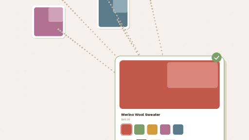
The current product’s swatch is highlighted with a selected border, fill, or whatever style you configure. Customers immediately see which color this card represents.
Hovering a different swatch swaps the card image. The thumbnail updates in real time to preview that color’s product photo. No page load, no popup. The hover image resolution is configurable from 300px to 2000px so you can balance sharpness and load speed.
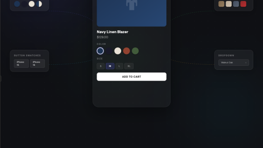
Clicking a swatch goes to that product’s page. They land on a full product page with its own images, description, price, URL, and swatch row for continued color browsing.
The product page swatch row looks like native Shopify variants. It sits exactly where the built-in variant selector would normally appear, right above Add to Cart. Customers click a color, the page updates with that color’s photos, price, and stock status. They have zero reason to think these are separate products. The experience is identical to picking a variant, just without the 3 option limit, without shared images, and without cramming everything under one URL.
Setting Up Collection Page Swatches Step by Step
Assuming you’ve installed Rubik Combined Listings and created your product groups, here’s how to configure the collection page side.
Activate the App Embed
Go to Online Store, Themes, Customize, then App Embeds. Toggle Rubik Combined Listings on. Without this step, nothing renders on the storefront. The app dashboard shows a green “Active” badge when the embed is running.
Select Your Theme Type
Every Shopify theme structures its product card HTML differently. The app needs to know your theme so it injects swatches in the correct position within each card.
Open the app embed settings and pick your theme. Dawn, Refresh, Impulse, Prestige, Symmetry, Pipeline, Warehouse, Focal, Sense, Craft, and every theme from the Shopify Theme Store is supported. Custom themes and page builders (PageFly, GemPages, EComposer) work too.
If swatches appear but in the wrong position on the card, wrong theme type is almost always the cause.
Choose Your Swatch Type for Product Cards
Open any product group, go to Visual Settings, and find the Product Card section. Product page and product card swatches have completely independent settings, so what you pick for the collection grid doesn’t affect the product page.
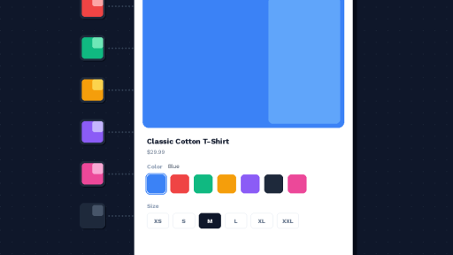
Color swatches. Solid color circles or squares. Single-color or two-color fills. Two-color swatches split vertically, horizontally, or diagonally for products with dual-tone colorways. Set colors with the hex picker or use the eyedropper tool to sample from product photos.
Image swatches. Small product photo or custom texture thumbnail. Pick the image source: first product image, second image, last image, custom upload, or auto (tries custom image first, then colors, then product photo as fallback). Best for fabrics, patterns, materials, printed designs.
Button swatches. Text labels inside clickable rectangles. Optionally include a small image. Best for non-visual options like sizes (S/M/L/XL), device models, pack quantities. Can also display price inside the button.
Dropdown. A native select menu. Minimal footprint on the card. Out-of-stock products get “(Sold out)” appended automatically.
For a guide on choosing the right swatch type by product category: How to Display Product Variants as Swatches on Shopify.
Pick a Product Card Preset
Start from a preset instead of configuring every detail. 8 presets are designed specifically for collection grids:
Compact square swatches (one row). Compact rounded swatches (one row). Compact circle swatches (one row). Compact square swatches (multi rows). Compact rounded swatches with solid borders (one row). Compact dropdown. Compact square buttons (one row). Compact square buttons with images (one row).
Pick one that fits your store’s look, then adjust from there.
Control How Many Swatches Show Per Card
Space on a product card is limited. Two settings keep things clean:
Limit to one row. Swatches fit within a single row based on card width. Extra swatches trigger a “+N more” overflow indicator.
Max visible. Hard cap on visible swatches (0 = show all). Anything past the limit shows the same “+N more” indicator.
Both keep your collection grid looking tight regardless of how many color options each product has.
Desktop and Mobile: Separate Settings
You can style product card swatches independently for desktop and mobile. A 22px swatch works on a desktop grid but it’s too small to tap on a phone. Set 22px for desktop and 36px for mobile without compromising either.
The “Copy desktop to mobile” button gives you a starting point. Adjust sizes up for touch targets after copying. Apple recommends minimum 44x44px for tappable elements.
App Blocks for Faster Loading (Optional)
The default app embed injects swatches via JavaScript after page load. Fine for most stores.
For heavy collection pages (50+ products visible), App Blocks load swatches inline with the page HTML instead of injecting after the fact. Add the Rubik product card block directly in your theme customizer. Easy mode lets you reposition without editing templates.
Hover Image Swap Settings
Controlled globally in Settings:
Change product card image on hover. When enabled, hovering a swatch on a collection card replaces the thumbnail with that product’s image.
Product card hover image resolution. Set the loaded image width from 300px to 2000px. For most stores 600-800px balances quality and speed.
Out-of-Stock Behavior on Collection Cards
When a product in the group sells out, its swatch can be:
Hidden. Disappears from all cards. Customers only see available colors.
Pushed to end. Available colors first, sold-out ones at the back.
Styled differently. Reduced opacity (0.1 to 1.0), diagonal strikethrough line, or both. Line color and opacity are configurable.
Dropdown swatches add “(Sold out)” to the option text automatically.
How This Works With Variant Image Filtering
If your separate products also have variants within them (like sizes), there’s a related problem. A customer picks size Medium on your navy jacket, but the gallery shows photos for every size mixed together.
Rubik Variant Images assigns images to specific variants and filters the gallery when a variant is selected. Pick Medium, see only medium photos.
The two apps handle different layers:
- Combined Listings = color swatches connecting separate products (collection cards + product pages)
- Variant Images = gallery filtering per variant within a single product
They’re built by the same team and designed to work side by side. For the full breakdown of how both apps create a seamless shopping flow from collection to checkout, this post on rubikvariantimages.com covers the combined experience.
SEO: Why Separate Products Rank Better
Each product has its own URL, title tag, and meta description. Google indexes “navy cotton jacket” and “cream cotton jacket” as separate pages, each targeting their own keywords. Swatch links create internal linking between siblings, distributing authority. Google Shopping gets color-specific feed entries with matching thumbnails.
Full analysis: Combined Listings and SEO: Do Separate Products Help or Hurt Your Rankings?
General comparison: Separate Products vs Variants on Shopify
Shopify Plus Not Required
Shopify’s native Combined Listings feature requires Plus ($2,300+/month). Rubik works on Basic ($39/month) with more features: collection page swatches, hover image swap, 4 swatch types, 20+ presets, separate desktop/mobile styling, Magic Fill AI setup, two-tone color swatches, categories, carousel layouts, and 70+ CSS variables.
Comparison: Native vs Third-Party Combined Listings Apps
Setup without Plus: How to Create Combined Listings on Shopify Without Plus
Alternative: Keep Variants, Still Show Them Separately on Collection Pages
If restructuring your catalog into separate products isn’t practical for your store, there’s another approach. Stamp – Variants on Collection takes your existing variant setup and splits each variant into its own card on the collection grid. No new products needed. Your Shopify admin stays the same, but the collection page shows every color or size as a separate card.
It supports hiding out-of-stock variants, per-variant add-to-cart on the collection, manual variant sorting, and per-collection display settings.
The downside compared to the separate products approach: you don’t get individual URLs per color, so the SEO benefits aren’t there. And the product page stays a single page with a standard variant picker rather than a swatch row linking to dedicated product pages. But if you have a large catalog and migrating to separate products feels like too much work right now, it’s a solid option to get your collection grid looking right.
Quick Start
- Install Rubik Combined Listings
- Activate app embed, select your theme type
- Create a product group, add products, set colors (or Magic Fill)
- Visual Settings, Product Card section, pick a compact preset
- Enable collection swatches, adjust mobile sizing
- Test on your actual phone
Demo store: combinedlistings.rubikdemo.com – browse a collection on desktop and mobile.
Setup video: YouTube
All settings explained: Knowledge Base
Related reading: How to Add Color Swatches to Shopify Collection Pages · Shopify’s Variant Limit and How to Get Around It · Shopify Color Swatches Not Working? Troubleshooting Guide · Shopify Only Shows One Card Per Variant Group – Here’s the Fix (CraftShift) · Best Shopify Combined Listings Apps Compared (CraftShift) · How to Group and Link Separate Products With Swatches (CraftShift) · RubikVariantImages.com