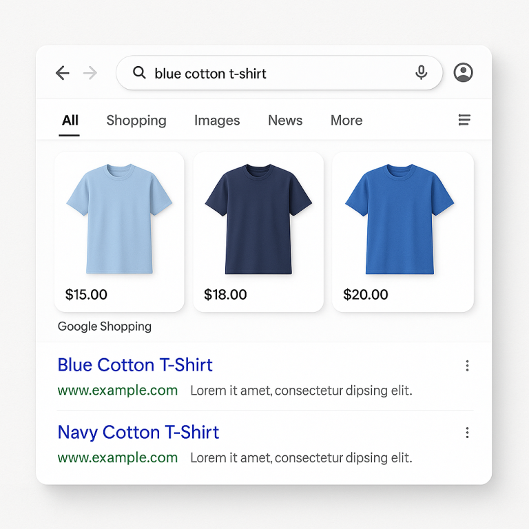
Shopify’s default variant selector is a dropdown menu. It works, but it hides your options behind a click. The customer has to open the dropdown, scan a text list of color names like “Ocean Blue” and “Midnight Black,” and try to guess what those actually look like. For products where the visual matters (which is most products), this is a conversion problem.
Swatches replace that dropdown with something visual. A row of colored circles, product thumbnails, or labeled buttons that the customer can see and compare at a glance. No clicking to reveal options, no guessing what “Dusty Rose” looks like.
This guide covers the three main swatch types, when to use each one, and how to set them up on Shopify.
Dropdowns vs. Swatches: What Changes
The functional difference is simple: dropdowns hide options, swatches show them. But the downstream effects are bigger than you’d expect.
Discovery. With a dropdown, the customer sees “Color” and a single selected value. They might not even realize there are other options unless they click. With swatches, all options are visible immediately. A customer who came for the black version might spot the green one and buy both.
Speed. Selecting a variant from a dropdown takes three interactions: click to open, scroll to find, click to select. A swatch takes one: click the color you want. On mobile, where dropdown menus are especially clunky, this difference matters more.
Confidence. A color name in a dropdown is abstract. A color swatch is concrete. The customer sees the actual shade, not a word. For image swatches showing fabric textures or patterns, the gap is even wider. You’re replacing imagination with information.
Visual appeal. A row of color swatches adds visual interest to the product page. It communicates variety without the customer reading anything. The page itself looks more polished and professional.
The Three Swatch Types
Not all swatches are the same, and choosing the wrong type for your product can be worse than a dropdown.
Color Swatches
A small circle or rounded square filled with a solid color. This is the most common swatch type and what most people think of when they hear “color swatches.”
Use when: The option is a single, solid color that can be accurately represented by a hex value. T-shirt colors, phone case colors, solid paint colors, single-tone accessories.
Don’t use when: The color is a pattern, gradient, texture, or multi-tone. “Heather Gray” doesn’t translate to a single hex code. Neither does “Floral Print” or “Walnut Wood Grain.”
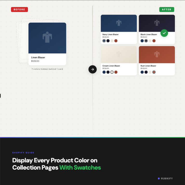
Two-tone color swatches are a variation where the swatch circle is split into two colors. This works for products that combine two colors (like a shoe with a white sole and blue upper, or a two-tone phone case). Rubik Combined Listings supports two-color swatches with configurable split directions.
Image Swatches
A small thumbnail image used as the swatch. Instead of a color fill, the swatch shows a cropped photo of the actual product, material, or pattern.
Use when: The option involves a texture, pattern, print, or material that a solid color can’t represent. Fabric options (linen, velvet, cotton), wood finishes, marble patterns, printed designs, multi-color patterns. Also useful when your product photography is strong and you want the swatch to show a mini version of the product itself.
Don’t use when: The images are too similar at small sizes (like slightly different shades of white), or when the visual detail gets lost at 24-36px. In those cases, labeled buttons might be clearer.
Button Swatches
A text label inside a rectangular button, similar to size selectors on most clothing sites.
Use when: The option is text-based and doesn’t have a meaningful visual component. Sizes (S, M, L, XL), materials described by name (Cotton, Polyester, Silk), styles (Regular, Slim, Relaxed), quantities or pack sizes.
Don’t use when: The option has a strong visual component. Showing “Navy Blue” as a text button when you could show the actual color is a missed opportunity.
When to Use Which: A Quick Reference
| Product Type | Option | Recommended Swatch | Why |
|---|---|---|---|
| T-shirts | Color | Color swatch | Solid colors translate perfectly to hex |
| Sofas | Fabric | Image swatch | Texture and pattern matter |
| Shoes | Color combo | Two-tone color swatch | Two-color products need both shown |
| Jewelry | Metal | Color swatch (gold/silver/rose) | Metallic colors are visually distinct |
| Curtains | Pattern | Image swatch | Pattern detail is the deciding factor |
| Clothing | Size | Button swatch | Text-based, no visual component |
| Phone cases | Design | Image swatch | Printed designs need visual preview |
| Paint | Color | Color swatch | Exact shade is the product itself |
| Furniture | Wood finish | Image swatch | Grain and tone vary too much for solid color |
| Supplements | Flavor | Button swatch | “Chocolate” and “Vanilla” are names, not visuals |
How Swatches Work on Shopify
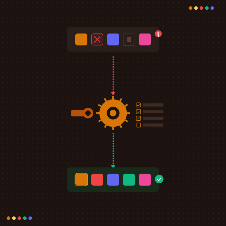
Shopify doesn’t have built-in swatch rendering for most themes. The default variant selector is the dropdown, and changing it requires either theme code editing or an app.
Native Variant Swatches (Theme-Dependent)
Some Shopify themes have started adding basic swatch support. Dawn (Shopify’s free theme) offers a pill/button selector option for variants. A few premium themes go further with color dot rendering.
The limitation is that these are tied to Shopify’s variant system. Each swatch represents a variant of the same product. The swatch colors are usually derived from the variant option name (so “Red” gets a red dot), which means you’re depending on Shopify’s color name recognition. Custom colors like “Dusty Rose” or “Ocean Mist” may not render correctly.
App-Based Swatches
Apps give you more control. There are two categories:
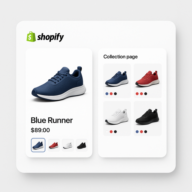
Variant swatch apps change how variants within a single product are displayed. Instead of a dropdown, they render swatches for each variant option. Rubik Variant Images (5.0★, 316+ reviews, Built for Shopify) does this while also filtering the product image gallery to show only the selected variant’s photos. It supports color swatches, image swatches, and custom image selectors. More at rubikvariantimages.com.
Combined listings apps display swatches that connect separate products. Each swatch links to a different Shopify product with its own URL, images, and inventory. Rubik Combined Listings offers color swatches (single and two-tone), image swatches, button swatches, and dropdown selectors for this purpose.
Which do you need? If your colors are variants under one product, you need a variant swatch app. If your colors are separate products, you need a combined listings app. If you have both setups in your store, you can run both apps. They’re built by the same team (Craftshift) and designed to work together.
For more on whether to use variants or separate products, see our guide on separate products vs. variants.
Setting Up Swatches: The Practical Steps
For Variant-Based Products (Rubik Variant Images)
- Install Rubik Variant Images and enable the app embed
- Assign images to each variant (the AI auto-assignment feature speeds this up)
- Choose your swatch type: color swatches, image swatches, or custom image selectors
- The app replaces the default dropdown with your chosen swatch style
- When a customer selects a swatch, only that variant’s images show in the gallery
For Separate Products (Rubik Combined Listings)
- Install Rubik Combined Listings and enable the app embed
- Create a product group and add your products
- Set the option name (like “Color”) and assign values to each product
- Use Magic Fill to auto-detect values from product titles and assign colors from images
- Choose your swatch type and style preset
- Swatches appear on product pages and optionally on collection pages
For a video walkthrough of the full combined listings setup, there’s a step-by-step tutorial on YouTube.
The knowledge base has detailed guides for swatch configuration, including how to set custom colors and images for each swatch.
Swatch Design Best Practices
Size matters. Swatches should be large enough to distinguish colors but small enough to not dominate the page. For product pages, 32-44px works well for color swatches, 40-56px for image swatches. For collection pages, go smaller: 20-28px for color, 28-36px for image.
Selection state needs to be obvious. When a customer clicks a swatch, they need instant visual feedback that it’s selected. A border, ring, or scale change works. The unselected swatches should be visually distinct from the selected one without being hard to see. Avoid using only a subtle border change as the selection indicator.
Out-of-stock styling matters. Don’t hide out-of-stock options completely (customers want to know what exists). Instead, use visual cues: reduced opacity, a diagonal strikethrough line, or pushing them to the end of the row. This signals “this exists but isn’t available right now” without removing it from view.
Consistent shape across the page. If your color swatches are circles, keep them circles everywhere (product page, collection page, quick view). Mixing circles and squares on different parts of the site looks unintentional.
Label accessibility. Not everyone can distinguish colors visually. Show the color name as a tooltip on hover (desktop) or below the swatch row as the selected value label. This also helps with colors that look similar on screen, like navy vs. black.
Mobile spacing. On touch screens, swatches need enough spacing between them that a thumb tap doesn’t accidentally select the wrong one. Apple’s recommended minimum touch target is 44px. Even if your swatches are 28px circles, add enough margin that the tappable area meets that threshold.
Common Mistakes
Using color swatches for non-color options. “Material: Cotton” rendered as a beige circle doesn’t communicate anything. Use a button swatch with the text “Cotton” instead.
Too many swatches without organization. 25 color swatches in a single row becomes visual noise. If you have more than 10-12 swatches, consider grouping them into categories or showing a subset with an expandable “Show all” option.
Mismatched swatch colors. If your “Navy Blue” swatch shows a color that doesn’t match the actual product photos, you’re creating a trust issue. Take the time to color-pick the exact hex values from your product images. For combined listings, Magic Fill does this automatically by analyzing product photos.
Ignoring the variant image problem. You add beautiful color swatches, but when the customer selects “Red,” the product gallery still shows photos of the blue version mixed in. Swatches set expectations. Your images need to match. For variant-based products, Rubik Variant Images solves this by filtering the gallery to show only the selected variant’s photos.
No fallback for images that fail to load. If you use image swatches and the image doesn’t load (slow connection, CDN issue), the customer sees a broken thumbnail. Make sure your app falls back to a color or text label when images aren’t available.
FAQ
There isn’t a single controlled study specific to Shopify, but the general ecommerce research consistently shows that visual variant selectors outperform dropdowns. The mechanism is straightforward: swatches show options without requiring interaction, which increases discovery and reduces decision friction. How much it moves your specific conversion rate depends on your product type (highly visual products benefit more) and your current customer behavior.
Yes. A common setup is color swatches for the Color option and button swatches for the Size option on the same product. The swatch type should match the nature of the option, not be uniform across all options.
The most reliable method is to color-pick hex values directly from your product photography. Open the product image in any image editor, use the eyedropper tool on the most representative area of the color, and copy the hex code. For combined listings, Rubik’s Magic Fill feature analyzes product images and suggests matching colors automatically.
For most stores, yes. Product page swatches are essential for variant selection. Collection page swatches help customers discover options before clicking through. They serve different purposes and the setup is typically independent. See our guide on collection page swatches for the collection-specific setup.
You can limit how many swatches display on mobile and show an overflow indicator (like “+8 more”) for the rest. This keeps the product page scannable on small screens. The customer can tap the overflow indicator or scroll the swatch row to see all options.
If your colors are variants within a single product, a variant swatch app like Rubik Variant Images handles it. If your colors are separate products connected together, a combined listings app like Rubik Combined Listings handles it. Both offer color, image, and button swatch types. If your store has a mix of both setups, you can run both apps together.
Useful Links: Rubik Combined Listings · Rubik Variant Images · Live Demo Store · Knowledge Base · YouTube Tutorial · RubikVariantImages.com · CraftShift Blog · Shopify Theme Store · Shopify Variant Apps