You installed a combined listings app. Swatches appear on your product pages. But they look generic. The colors do not match your brand. The shape feels wrong. The size is too small on mobile.
Rubik Combined Listings was built for this level of customization. 7 image sources, 11 product page presets, 8 collection page presets, 70+ CSS variables, 4 responsive contexts, and an AI visual settings assistant. This post covers every customization tool available and how to use them.
In this post
- 7 image sources for swatches
- 11 product page presets
- 8 collection page presets
- 70+ CSS variables
- 4 responsive contexts
- Dual-color swatches
- Price display in swatches
- AI Visual Settings Assistant
- Per-group visual settings
- Video walkthrough
- Frequently asked questions
- Related reading
7 image sources for swatches
Every swatch needs a visual. In Rubik Combined Listings, you pick from 7 image sources per product in a group:
- First image. The product’s first photo becomes the swatch image. Best for products where the first image is a clean product shot.
- Second image. Uses the second photo. Useful when your first image is a lifestyle shot and the second is a flat lay or swatch-friendly angle.
- Last image. Takes the last uploaded photo. Some merchants upload a dedicated swatch image last.
- Custom image. Upload a specific image for the swatch. A cropped fabric sample, a color block, a close-up texture. Full control over what appears.
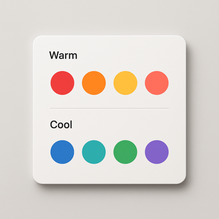
- One color (solid). A single hex color fills the swatch. Clean and simple. Works for products where the color is obvious: #FF0000 for red, #1B2A4A for navy.
- Two colors (dual-color split). Two hex colors split across the swatch in one of four directions: horizontal, vertical, diagonal left, diagonal right. Perfect for two-tone products or products that blend colors.
- Auto. The app cascades through sources automatically. It checks for a custom image first, then falls back to the product’s first image, then to a color. No manual setup needed.
You set the image source per product within a group. One product can use a custom uploaded swatch while another uses a solid color. Or set them all to “Auto” and let the app figure it out. If you use Magic Fill (AI), it picks the best color and generates the hex code from the product image automatically.
11 product page presets
Presets are starting points. Pick one, then customize from there. Rubik ships with 11 product page swatch presets:
- Color Circle. Small round swatches. Clean and minimal.
- Color Square. Same as circles but square-shaped.
- Color Pill. Rounded rectangular swatches with the color name inside.
- Image Circle. Product images cropped into circles.
- Image Square. Product images in square frames.
- Image Polaroid. Product images with a white border and label underneath, like a Polaroid photo.
- Image Card. Larger product image with title and price below.
- Button. Text-only buttons. Good for size or material grouping where images add no value.
- Button with Image. Text buttons with a small product image inline.
- Dropdown. A select menu instead of visible swatches. Saves space when you have 20+ options.
- Dropdown with Image. Dropdown menu where each option shows a small product thumbnail.
Each preset sets default values for the CSS variables (size, border radius, spacing, colors). You can override any of them. Start with “Color Circle” and change the radius to 0 to get squares. Or start with “Image Polaroid” and increase the image size. The preset is just a starting configuration.
8 collection page presets
Swatches on collection pages (product cards) need different sizing and spacing than product pages. Rubik has 8 collection-specific presets:
- Color Circle (compact). Smaller circles sized for product cards.
- Color Square (compact). Small squares for tight layouts.
- Color Pill (compact). Compact pills with color names.
- Image Circle (compact). Tiny product image circles.
- Image Square (compact). Small image squares.
- Image Polaroid (compact). Scaled-down polaroid style.
- Button (compact). Small text buttons.
- Dot. Tiny color dots. Maximum information density for large catalogs.
Collection page swatches let customers see available colors without opening each product. When a shopper clicks a color swatch on the collection page, the product card image updates to show that color. This is handled by Rubik Combined Listings, not variant image apps. Combined listings connect separate products, so each color has its own product page, photos, and SEO.
70+ CSS variables
Every visual aspect of the swatch is controlled by a CSS variable. You do not need to write CSS from scratch. Just change the variable value. Here are the main categories:
Swatch variables. Control the swatch itself: width, height, border radius, border color, border width, background color, gap between swatches, selected state border, hover effects, opacity, transition speed, shadow.
Button variables. For button-style swatches: font size, font weight, padding, text color, background, border, hover background, selected background, disabled state styling.
Dropdown variables. For dropdown-style swatches: menu width, item height, font size, separator color, hover background, selected indicator, thumbnail size.
Label variables. The option name label above the swatches: font size, font weight, color, margin, text transform, letter spacing.
Price variables. If you display prices in swatches: font size, color, compare-at-price color, formatting.
All variables use the Shadow DOM, which means your theme’s CSS cannot accidentally override them. The swatches look exactly how you set them, regardless of which theme you run. For CSS customization ideas and code snippets, see this guide on swatch CSS customization.
4 responsive contexts
What looks good on desktop does not always work on mobile. Rubik lets you set different variable values for 4 screen size contexts:
- Desktop. Screens 1024px and wider.
- Tablet landscape. 768px to 1023px.
- Tablet portrait. 480px to 767px.
- Mobile. Under 480px.
For example, your desktop swatches can be 48x48px with a 12px gap. On mobile, you might want 36x36px with an 8px gap so they fit without horizontal scrolling. Set the variables once per context and Rubik handles the rest. No media queries to write.
The live admin preview shows each context so you can see exactly how swatches look at every screen size before saving.
Dual-color swatches
Some products are not a single color. A “Navy/White” striped shirt, a “Black/Gold” two-tone watch, a “Pink/Grey” ombre scarf. A single hex color does not represent these well.
Rubik’s dual-color swatches split two colors across the swatch area. You pick two hex codes and a split direction:
- Horizontal split. Top half one color, bottom half another.
- Vertical split. Left half and right half.
- Diagonal left. Split from top-right to bottom-left.
- Diagonal right. Split from top-left to bottom-right.
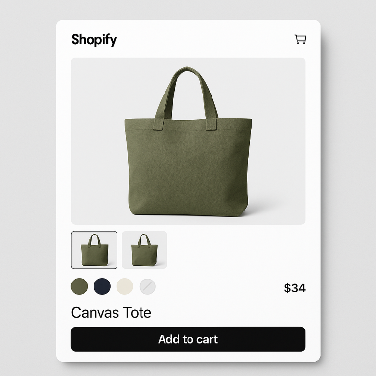
Dual-color swatches work on product pages and collection pages. They are set per product in a group, so your “Navy/White” product can use a dual-color swatch while your solid “Red” product uses a single color. This level of per-product control is unique to Rubik.
Price display in swatches
When products in a group have different prices, customers want to know the price before clicking. Rubik can show the price directly in or near the swatch.
With button-style and polaroid-style swatches, the price appears below the option name. Image card swatches show the price as part of the card layout. You control the price format, font size, and whether to show compare-at prices (strikethrough pricing) using CSS variables.
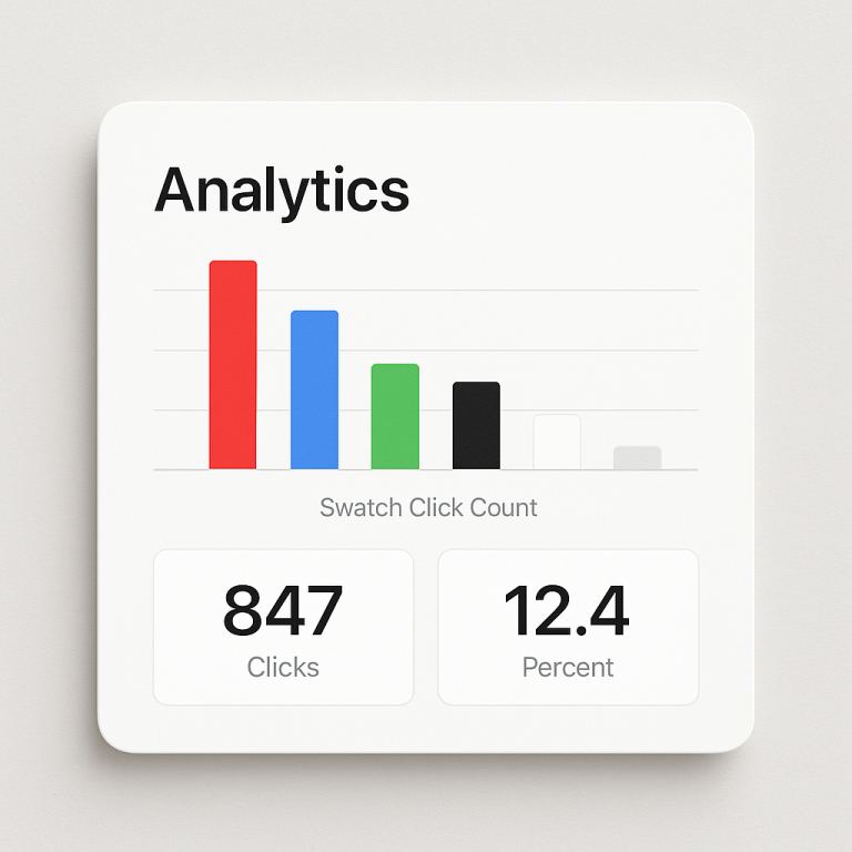
This is especially useful for stores where color choices affect price. Leather vs fabric. Organic vs standard cotton. Customers see the price difference at a glance without clicking through each option. To learn how to track which price points get the most clicks, read about tracking swatch clicks in Google Analytics.
AI Visual Settings Assistant
If CSS variables feel overwhelming, skip them. Use the AI Visual Settings Assistant instead.
Type what you want in plain language: “make the swatches bigger,” “add a thicker border to the selected swatch,” “use rounded corners,” “reduce the gap between swatches.” The AI translates your description into CSS variable changes and applies them. The live preview updates instantly so you see the result before saving.
You can make multiple requests in sequence. “Now make the label text smaller.” “Change the selected border to blue.” Each request builds on the previous one. If you do not like a change, ask the AI to undo it. Or reset to a preset and start over.
The AI assistant is available on every plan, including the free plan. It uses AI credits from your monthly allowance. For full details on the setup process, see our step-by-step guide.
Per-group visual settings
Most combined listings apps apply one global swatch style to every group. All your products look the same. Rubik lets each product group have its own independent visual design.
Your shoe group can use large image card swatches with prices. Your t-shirt group can use compact color circles. Your accessories group can use a dropdown. Each group is designed separately in the swatch style editor. Changes to one group do not affect any other group.
This is especially useful for stores with diverse product types. A furniture store selling sofas (needs large image swatches) and throw pillows (needs tiny color dots) can give each category the right swatch design. Learn more about how this fits into the overall combined listings workflow.
For merchants who also need to fix color accuracy in product images, see how to improve color swatch accuracy on CraftShift.
Video walkthrough
See swatch customization in action, including presets, CSS variables, dual-color swatches, and the AI assistant:
Frequently asked questions
How many swatch presets does Rubik Combined Listings have?
19 total. 11 for product pages (color circle, color square, color pill, image circle, image square, image polaroid, image card, button, button with image, dropdown, dropdown with image) and 8 for collection pages (compact versions plus a dot style).
Do I need to write CSS to customize swatches?
No. You can use the visual editor to change values for 70+ CSS variables without writing code. Or use the AI Visual Settings Assistant and describe what you want in plain language. The AI applies the changes for you.
Can different product groups have different swatch designs?
Yes. Each product group has its own independent visual settings. Your shoes can use image card swatches while your t-shirts use color circles. Changes to one group do not affect others.
What are dual-color swatches?
Dual-color swatches display two hex colors split across the swatch in one of four directions: horizontal, vertical, diagonal left, or diagonal right. They represent two-tone products like “Navy/White” or “Black/Gold” where a single color would not be accurate.
Can I set different swatch sizes for mobile and desktop?
Yes. Rubik has 4 responsive contexts: desktop, tablet landscape, tablet portrait, and mobile. You set swatch dimensions, gaps, and other visual properties independently for each screen size. No media queries needed.
Will my theme CSS break the swatch styling?
No. Rubik renders swatches inside a Shadow DOM, which isolates swatch CSS from your theme CSS. Your theme cannot accidentally override swatch styles, and swatch CSS cannot break your theme. The swatches look exactly how you set them.