Collection pages are where most shopping decisions start. A customer lands on your “Jackets” collection, sees a grid of product cards, and scrolls. Each card shows one image. One color. If your jacket comes in 6 colors, the other 5 are invisible unless the shopper clicks through to the product page.
Collection page swatches change this. Small color circles appear on each product card, showing every available option at a glance. Hovering a swatch previews that color by swapping the card image. This keeps shoppers on the collection page longer and helps them find the color they want without extra clicks.
In this post
- Why collection page swatches matter
- How collection swatches work with combined listings
- Swatch types: color, image, button
- Image swap on hover
- Mobile considerations
- Simulating your layout before setup
- Product page swatches vs collection page swatches
- Video walkthrough
- Frequently asked questions
- Related reading
Why collection page swatches matter
Think about how people shop. They land on a collection page, scan the grid, and make a split-second decision about each product card. No swatch means one color per card. The shopper sees 20 cards but might miss the exact color they are looking for because it was hidden behind a click.
Swatches on product cards solve this by showing available options upfront. A shopper scanning your “Sneakers” collection sees that the “Street Runner” comes in white, black, gray, and red – all without clicking. This reduces the number of clicks to find the right product and keeps customers browsing your collection instead of bouncing.
There is also a psychological effect. Seeing multiple color options signals variety and choice. A product card with 6 color swatches feels more substantial than a lonely single-image card. It tells the customer “we have options for you.” Stores using collection swatches typically see higher click-through rates from collection pages to product pages.
How collection swatches work with combined listings
Collection page swatches in Rubik Combined Listings are powered by product groups. You group separate products together, and the app automatically renders swatches on every product card in that group. No manual placement needed.
The swatches appear on collection pages, search results, and related products sections. When a shopper clicks a swatch on a collection page, they navigate to that specific product’s page. If they hover (on desktop), the card image swaps to preview the color.
This is different from variant-based swatches. With variants, all options live under one product listing, so clicking a “color swatch” on the collection page takes you to the same product URL with a parameter change. With combined listings, each swatch links to a completely separate product with its own URL, images, and SEO data. This is what makes combined listings powerful for both user experience and search engine optimization.
Swatch types: color, image, button
Rubik Combined Listings offers three main swatch types for collection pages, each suited to different product types.
Color swatches. Solid color circles or squares. Best for products where the option is a simple color – clothing, accessories, homeware. You set the hex color for each option value, and the swatch renders that color. Clean and minimal. This is the most popular swatch type for fashion and apparel stores.
Image swatches. Tiny thumbnail images inside the swatch shape. Useful for patterns, prints, textures, or materials where a solid color does not tell the full story. A marble pattern, a floral print, or a wood grain texture all look better as image swatches. You can also use product images as swatch fills.
Button swatches. Text-based buttons showing the option name. Good for non-visual options like sizes, scents, or flavors. “Small,” “Medium,” “Large” displayed as clickable buttons. Also useful for two-color products – the two-color swatch guide covers how to show bicolor options.
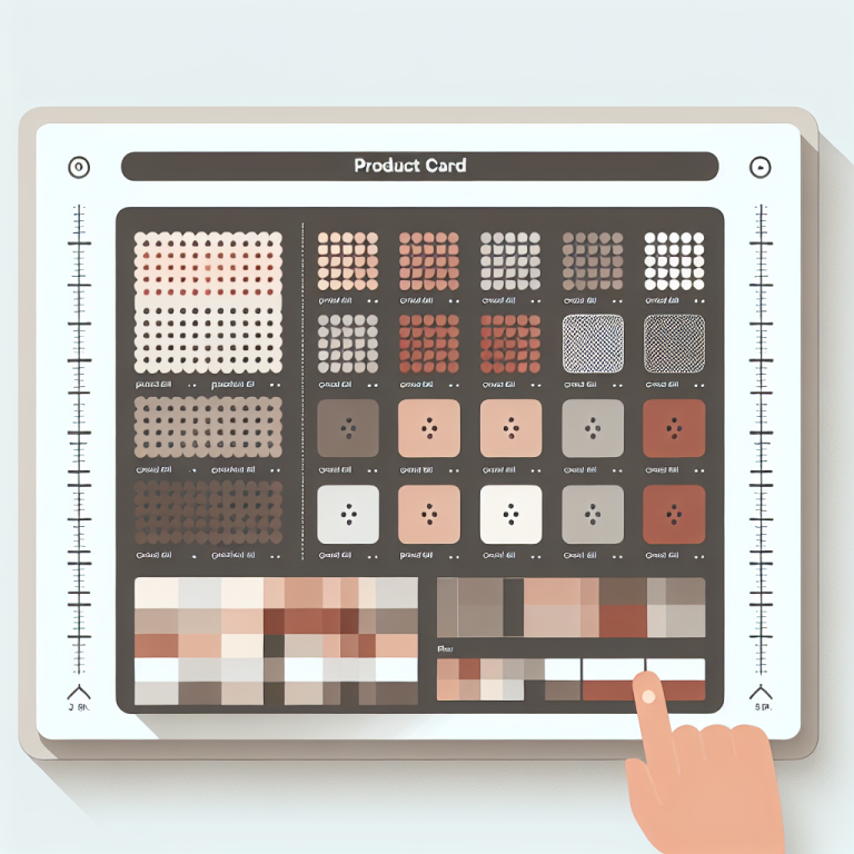
You can preview how each type looks using the Swatch Simulator tool. Upload your product images, pick swatch styles, and see a mock collection page layout. This saves time because you can test different styles before committing to one in the app.
Image swap on hover
One of the most effective features of collection page swatches is image swap. When a shopper hovers over a swatch on desktop, the product card image changes to show that color’s product photo. No click needed. The customer sees a preview instantly.
Image swap works because Rubik stores each product’s image URL in the group data. When the swatch receives a hover event, JavaScript swaps the card’s image source. This happens locally with no network request for the image – the browser already has it cached from the collection page load.
For stores with many products per group, image swap dramatically reduces the effort needed to browse options. Instead of clicking into 8 product pages to see 8 colors, the shopper hovers over 8 swatches and sees all of them in 3 seconds. Fewer clicks, faster decisions. For guidance on customizing how swatches look and behave, see the swatch customization guide.
Mobile considerations
More than 70% of Shopify traffic comes from mobile devices. Collection page swatches need to work well on small screens or they hurt more than they help.
Space is limited. A product card on mobile is roughly 160-180px wide. Ten swatches will not fit. Rubik handles this with overflow controls – you set a maximum number of visible swatches, and the rest are hidden behind a “+N more” indicator. For most stores, showing 4-5 swatches on mobile with overflow for the rest works well.
No hover on touch. Mobile devices do not have hover states. On mobile, tapping a swatch navigates directly to that product. The image swap behavior is desktop-only. This means swatch size matters more on mobile – they need to be large enough to tap accurately. The app lets you set different swatch sizes for mobile and desktop.
Swatch placement. On desktop, swatches typically sit below the product title. On mobile, you might want them closer to the image so they are visible without scrolling down the card. Rubik’s card presets handle positioning automatically for most themes, but you can override placement with custom CSS if needed.
Use the Two Color Preview tool to check how your swatch colors look against different background colors. White swatches on a white card background disappear without a border, for example. Testing this before setup prevents surprises.
Simulating your layout before setup
Before installing anything, you can test how swatches will look on your collection pages using the Swatch Simulator. Pick a swatch shape (circle, square, rounded), set the size, choose your colors, and see a preview grid that mimics a collection page layout.
This is useful for making design decisions without touching your live store. Do circles or squares match your brand better? How many swatches should show before overflow kicks in? Does the spacing feel right? Answer these questions in the simulator, then apply those same settings in the app. The app presets map directly to what you see in the simulator.
For a broader look at layout options (grid vs carousel, rows vs cards), see the grid vs carousel layout guide.
Product page swatches vs collection page swatches
Collection page swatches and product page swatches serve different purposes. Collection page swatches sit on product cards and let shoppers browse options from the grid. Product page swatches appear on individual product pages and let shoppers switch between grouped products.
Both are powered by the same product groups in Rubik Combined Listings. When you create a group, the app renders swatches in both locations automatically. You can customize each independently – different swatch sizes, shapes, and behaviors for product pages vs collection pages.
There is also a third type of swatch: variant image filtering on the product page. If a single product has multiple variants (say, a jacket with 3 sizes and each size photographed separately), you might want the product page gallery to filter images based on the selected variant. This is not what combined listings does. For variant-level image filtering, check out Rubik Variant Images swatch preview, which handles per-variant image display on product pages.
Video walkthrough
This video covers the AI-powered features in Rubik Combined Listings, including automatic swatch color detection and how swatches display on collection pages.
Getting started
Adding swatches to your collection pages takes a few steps: install Rubik Combined Listings, activate the app embed, create product groups, and choose your swatch style. The app is metafield-based with no external API calls, so swatches load with your page. No extra network requests, no speed penalty.
Pricing starts free with 5 product groups. Starter is $10/month for 100 groups, Advanced is $30/month for 500 groups, and Premium is $50/month for 5,000 groups. Follow the setup guide for step-by-step instructions.
For more on how swatches interact with your existing collection setup, read the collection page optimization guide on CraftShift.
Frequently asked questions
How do I add swatches to Shopify collection pages?
Install a combined listings app like Rubik Combined Listings, create product groups, and activate the app embed. Swatches appear automatically on product cards across collection pages, search results, and related product sections. No code changes required.
Do collection page swatches swap the product card image?
Yes, on desktop. Hovering over a swatch swaps the product card image to show that color’s photo. On mobile, tapping a swatch navigates directly to that product’s page since mobile devices do not have hover states.
How do swatches look on mobile?
Rubik lets you set a maximum number of visible swatches on mobile. Extra swatches hide behind a “+N more” indicator. You can also set different swatch sizes for mobile and desktop. Most stores show 4-5 swatches on mobile.
What swatch types are available?
Three types: solid color (hex codes), image (patterns, textures, product thumbnails), and button (text labels). You can mix types within a group – for example, color swatches for most options and an image swatch for a patterned option.
Will swatches work with my theme?
Rubik Combined Listings supports 350+ Shopify themes. Swatches render inside Shadow DOM to avoid CSS conflicts. If your theme is not auto-detected, you can select it manually from the app dashboard.
Do collection swatches slow down my store?
No. The app is metafield-based with no external API calls. Swatch data loads with the page, not from a separate server. There are no extra network requests that would affect page speed.
What is the difference between collection page swatches and product page swatches?
Collection page swatches appear on product cards in the grid and let shoppers browse options without clicking through. Product page swatches appear on the product page itself and let shoppers switch between grouped products. Both are created from the same product groups. For variant-level image filtering on the product page, use Rubik Variant Images.