Your combined listing group has 15 color options. How should they appear on the product page? All at once in a grid? Or in a swipeable carousel where customers scroll through them? The right answer depends on how many options you have, how big your swatches are, and how much vertical space you can afford.
Rubik Combined Listings gives you both layout modes with full control over the behavior of each. Grid uses CSS Grid auto-fill with overflow controls. Carousel uses RubikSwiper, a namespaced slider that auto-calculates slide widths and hides navigation when all swatches fit. This post covers how each works and when to pick one over the other.
In this post
- How grid layout works
- Grid overflow: limit to one row and +N more
- How carousel layout works
- Carousel navigation and auto-hiding arrows
- Per-category rendering
- When to use grid vs carousel
- Mobile considerations
- How to configure each layout
- Video walkthrough
- Frequently asked questions
- Related reading
How grid layout works
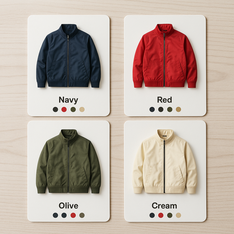
Grid mode places swatches in a CSS Grid container using auto-fill. The grid automatically calculates how many swatches fit per row based on the swatch width and the available container space. If your swatch is 44px wide with 8px gaps, and the container is 400px, you get roughly 8 swatches per row. The grid wraps to additional rows as needed.
This means the layout is naturally responsive. On a wider screen, more swatches fit per row. On a narrower screen, the grid wraps earlier. You do not need to set breakpoints or specify column counts. The CSS Grid handles the math.
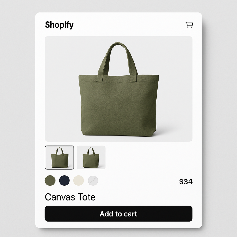
Grid is the default layout in Rubik Combined Listings. It works well when you want customers to see all available options at a glance. No interaction required, no scrolling needed. Every swatch is visible the moment the section loads. For stores that want to customize the swatch appearance within the grid, the swatch customization guide covers all the visual options.
Grid overflow: limit to one row and +N more
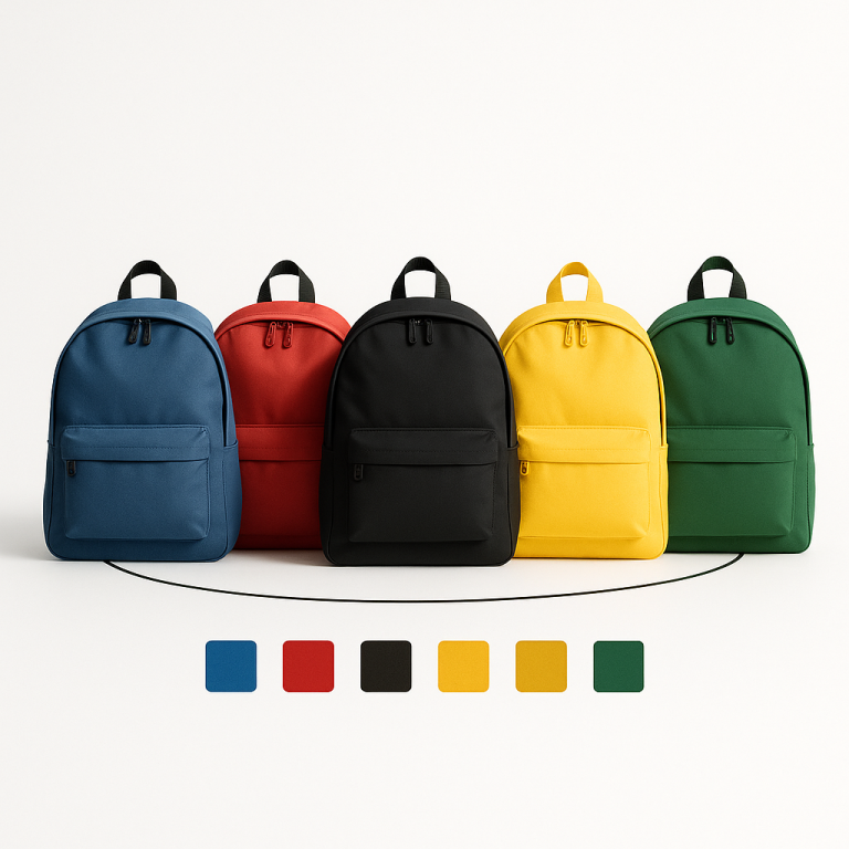
Showing all swatches works with 8 options. With 30 options, the grid takes up too much vertical space. Rubik provides two controls to manage this.
Limit to one row. When enabled, the grid only shows swatches that fit in a single row. Extra swatches are hidden. This keeps the swatch section compact and predictable. The row contains as many swatches as the container width allows, and the rest are tucked away.
Max visible. You can set a maximum number of visible swatches. If you set it to 10, only the first 10 swatches appear regardless of how many fit in a row. This gives you explicit control over the count.
When either limit is active, Rubik shows a “+N more” overflow indicator. If 30 swatches exist and 10 are visible, customers see “+20 more” at the end of the row. Clicking it expands to show all swatches. This pattern keeps the initial view clean while confirming that more options exist.
The “+N more” indicator is styled through CSS variables. You can match it to your theme’s font, color, and size. It acts like another swatch in the row, maintaining visual consistency.
How carousel layout works
Carousel mode places swatches in a horizontal slider powered by RubikSwiper. This is a namespaced slider component built specifically for Rubik. It is not Swiper.js or any third-party library. It is custom-built to avoid conflicts with other sliders on your page.
RubikSwiper auto-calculates slide widths based on the swatch dimensions and gap settings you configure. It does not require you to specify slides-per-view or breakpoints. The slider determines how many swatches fit in the visible area and makes the rest accessible by swiping or clicking arrows.
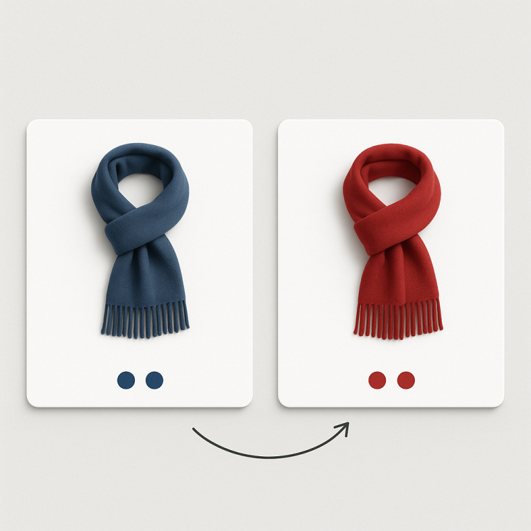
Customers on touch devices swipe left and right through the swatches. Desktop users click the navigation arrows or use scroll. The movement is smooth and snaps to swatch boundaries so partial swatches do not sit awkwardly at the edge. This matters for how swatches affect conversion rates, since a clunky interaction discourages exploration.
Carousel navigation and auto-hiding arrows
The carousel navigation arrows appear on the left and right edges of the swatch container. They are styled through CSS variables, so you can control the arrow size, color, background, border radius, and hover state.
Here is the smart part: arrows auto-hide when all swatches fit in the container. If your group has 4 swatches and the container is wide enough to show all 4, no arrows appear. It looks like a static row. As soon as the container narrows (smaller screen, sidebar layout) and swatches overflow, the arrows appear automatically.
This prevents the awkward situation where arrow buttons appear next to a group of 3 swatches that do not scroll. The carousel degrades gracefully to a static layout when scrolling is not needed, and activates navigation only when it is.
Per-category rendering
If you use categories to organize your swatches, both layout modes render per category. In grid mode, each category becomes its own grid section. In carousel mode, each category gets its own independent carousel.
Per-category carousels are especially useful. A “Warm Colors” category with 12 swatches gets its own carousel with arrows. A “Cool Colors” category with 4 swatches shows them all without arrows. Each category manages its own overflow independently.
This means you do not need to choose between grid and carousel based on your largest category. The layout adapts per category based on how many swatches each one contains.
When to use grid vs carousel
Use grid when:
- You have fewer than 12 options. All swatches fit without scrolling.
- You want all options visible immediately. No interaction needed to discover them.
- Your swatches are small (color circles, compact buttons). Many fit per row.
- Vertical space is not a concern. Multi-row grids are acceptable in your design.
Use carousel when:
- You have more than 12 options. Too many swatches to show at once.
- Your swatches are large (image cards, polaroid style). Each swatch takes significant width.
- Vertical space is limited. You want to keep the swatch section to one row height.
- You use categories with varying sizes. Each category carousel adapts independently.
Grid with “Limit to one row” is a middle ground. It shows a subset of swatches in a static row with a “+N more” indicator. It behaves like a carousel in terms of space savings but without the sliding interaction. This works well when you want a clean first impression with the option to expand.
Mobile considerations
On mobile, horizontal space is tight. A grid that shows 8 swatches per row on desktop might show only 4 on a phone. With 20 options, that is 5 rows of swatches taking up significant vertical space above the add-to-cart button.
Carousel works naturally on mobile because swiping is a native gesture. Customers already swipe through product photos, social media feeds, and stories. Swiping through swatches feels familiar. The touch interaction is optimized in RubikSwiper with proper momentum and snap behavior.
You can use Rubik’s responsive contexts to set different layouts for different screen sizes. Grid on desktop (where space is abundant) and carousel on mobile (where vertical space is precious). Or use carousel everywhere for consistency. The responsive contexts let you customize swatch size, gap, and layout independently per breakpoint.
How to configure each layout
- Open the swatch style editor. In Rubik Combined Listings, go to the group settings and open the visual editor for the product page.
- Choose the layout mode. Select Grid or Carousel from the layout options.
- For Grid: Optionally enable Limit to one row and set a Max visible count. The “+N more” indicator appears automatically when swatches overflow.
- For Carousel: Customize the arrow styling through CSS variables. The auto-hide behavior is built in. No configuration needed for the slide width calculation.
- Check responsive contexts. Switch between desktop, tablet, and mobile views in the editor. Set layout and swatch dimensions for each context if needed.
- Save and preview. Check the storefront on multiple screen sizes. Test the carousel swipe on a real phone if possible.
Both layouts work with all swatch presets: color circles, image squares, polaroid cards, buttons, and more. The layout mode controls arrangement and overflow. The preset controls individual swatch appearance. They are independent settings. For a full rundown of all swatch presets, see the swatch customization guide.
For variant-level image filtering on the product page (not combined listings), Rubik Variant Images handles that as a separate app with its own swatch styling options.
Video walkthrough
See both grid and carousel layouts in action, including overflow controls, arrow styling, and per-category rendering:
Demo store | Docs | Knowledge base
Frequently asked questions
What is the default swatch layout in Rubik Combined Listings?
Grid is the default layout. Swatches are placed in a CSS Grid container that auto-fills based on the swatch width and available space.
Does the carousel use Swiper.js or a third-party library?
No. Rubik uses RubikSwiper, a custom-built namespaced slider component. It avoids conflicts with other sliders on your page. No external slider library is loaded.
Can I hide the carousel navigation arrows?
The arrows auto-hide when all swatches fit in the container without scrolling. You can also style them to be invisible using CSS variables if you want swipe-only navigation on all screen sizes.
What does the “+N more” indicator do in grid layout?
When you use “Limit to one row” or “Max visible” in grid mode, a “+N more” indicator appears showing how many additional swatches are hidden. Clicking it expands the grid to show all swatches.
Can I use grid on desktop and carousel on mobile?
Yes. Rubik’s responsive contexts let you set different layout modes and swatch dimensions for desktop, tablet, and mobile independently.
Do grid and carousel work with categories?
Yes. Both layouts render per category. In grid mode, each category becomes its own grid section. In carousel mode, each category gets its own independent carousel with separate navigation.
Related reading
- How to organize combined listing swatches into categories
- How to customize combined listing swatches
- Shopify combined listings FAQ
- Shopify combined listings explained
- How combined listings handle out-of-stock products
- How variant image swatches affect conversion rates (CraftShift)
- Swatch CSS customization ideas (Rubik Variant Images)