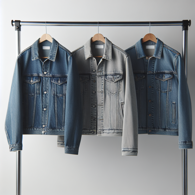
A product card on a collection page shows one image. One color. If your product comes in 8 colors, the customer sees only the default. The other 7 are hidden behind a click. Most shoppers never make that click. They scroll past and assume you only carry one option.
Rubik Combined Listings solves this by adding swatches directly to product cards. Each swatch represents a grouped product. Hovering a swatch swaps the card image to preview that color. This works on collection pages, search results, and related products sections. This post covers the 8 product card presets, image swap behavior, overflow handling, and how to set everything up.
In this post
- What are product card swatches?
- The 8 product card presets
- Image swap on hover
- Overflow handling: +N more and row limits
- Setup steps
- Desktop vs mobile settings
- Video walkthrough
- Frequently asked questions
- Related reading
What are product card swatches?
Product cards are the tiles you see on collection pages, search results, and related products sections. Each card shows one product image, a title, and a price. No way to browse color options without clicking through to the product page.
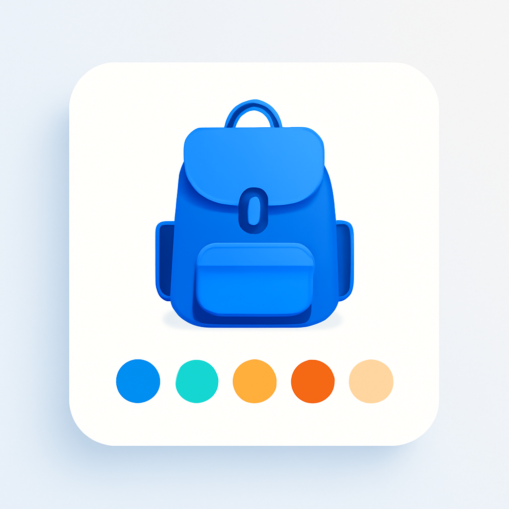
Product card swatches change this. Small color circles, image thumbnails, or buttons appear on each card. Each swatch represents a different product in the group. Customers see all available colors at a glance and preview them by hovering.
In Rubik Combined Listings, card swatches are powered by the same grouping system used on product pages. You group separate products together, and the app renders swatches on both the product page and every product card across your store. Card swatches render inside Shadow DOM to avoid CSS conflicts with your theme.
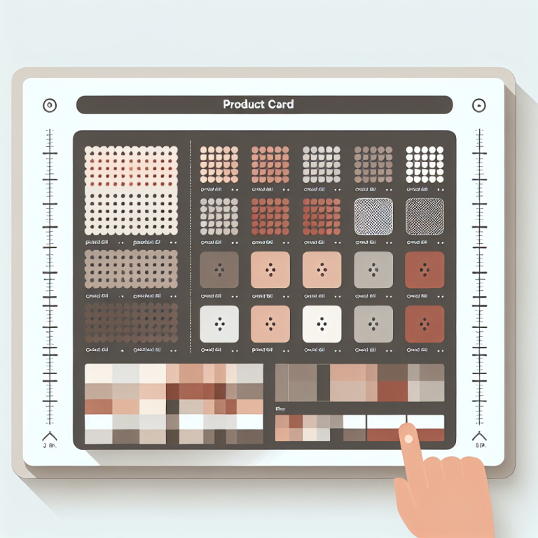
The 8 product card presets
Rubik gives you 8 preset styles for product card swatches. Each controls shape, size, and arrangement.
- Compact square (one row). Small square swatches in a single row. Clean and minimal.
- Compact rounded (one row). Single-row layout with rounded corners. Softer look for lifestyle brands.
- Compact circle (one row). Circular swatches in a single row. The most common style for color options.
- Compact square (multi rows). Square swatches that wrap to additional rows. Shows every option without truncating.
- Compact rounded with borders (one row). Rounded swatches with a visible border. Useful when swatch colors are close to your card background.
- Compact dropdown. A dropdown selector instead of inline swatches. Minimal space. Good for products with many options.
- Compact square buttons (one row). Button-style swatches in a single row. Good for text-based options like sizes.
- Compact square buttons with images (one row). Buttons with small product images. Most visual information per swatch.
You can preview all 8 presets on the demo store. For deeper customization of swatch appearance (colors, sizes, CSS variables), see the swatch customization guide.
Image swap on hover
When a customer hovers over a swatch on a product card, the card image changes to show that product. The shopper can scan through 6 colors in 2 seconds by moving the cursor across the swatches. No page navigation needed.
The swap image resolution is configurable between 300px and 2000px. For most collection pages, 600px to 800px balances clarity and speed. Images are lazy-loaded on hover, so they do not slow the initial page load.
On mobile, the hover interaction translates to a tap. The first tap previews the color. A second tap navigates to the product page. Image swap works with all 8 presets and alongside Shopify’s native secondary image hover.
Overflow handling: +N more and row limits
Product cards have limited horizontal space. If your group contains 15 products, showing all 15 in a single row is not realistic. Rubik handles this with two controls.
“+N more” indicator. When swatches exceed available space, a “+3 more” or “+7 more” label appears at the end of the row. “Limit to one row” with “Max visible” lets you restrict swatches to a single row with a set maximum. Set max visible to 5 on a group of 12, and the card shows 5 swatches plus “+7 more”.
The multi-row preset wraps to additional rows instead of truncating. For more on overflow behavior, see the grid vs carousel layout guide.
Setup steps
- Group your products. In the Rubik Combined Listings app, create a group and add products that represent different colors of the same item. Follow the setup guide if you have not done this yet.
- Enable product card swatches. In the app settings, turn on the product card swatch toggle. Rubik injects swatches into every product card that belongs to a group on collection pages, search results, and related products sections.
- Pick a preset. Choose one of the 8 presets. Preview your collection pages to confirm the style works with your theme layout.
From here, fine-tune image swap resolution, overflow settings, and responsive behavior. To show grouped products as separate items on collection pages, see how to show variants as separate products on collections.
Desktop vs mobile settings
Rubik uses 4 responsive contexts: product_page_desktop, product_page_mobile, product_card_desktop, and product_card_mobile. Each context has independent settings for swatch size, gaps, max visible count, and preset.
For product cards, the two relevant contexts are product_card_desktop and product_card_mobile. On desktop, cards are wider, so you might show 6 or 7 swatches before the “+N more” cutoff. On mobile, cards are narrower. Limit to 4 visible swatches and use smaller dimensions.
Demo store | Docs | Knowledge base
Video walkthrough
See product card swatches in action, including image swap, overflow handling, and responsive settings:
Frequently asked questions
Where do product card swatches appear?
They appear on collection pages, search results, and related products sections. Any place your theme renders a product card for a grouped product will show swatches.
Why do card swatches use Shadow DOM?
Shadow DOM isolates swatch styles from your theme CSS. This prevents your theme from overriding swatch dimensions or layout, and prevents swatches from breaking your theme styles. Consistent rendering across all Shopify themes.
What resolution should I use for image swap?
The swap resolution is configurable from 300px to 2000px. For most stores, 600px to 800px balances clarity and speed.
What happens when I have too many swatches for one card?
Rubik shows a “+N more” indicator at the end of the row. Control this with the “Limit to one row” option and “Max visible” setting. The multi-row preset wraps to additional rows instead of truncating.
Related reading
- Shopify combined listings setup guide
- How to customize combined listing swatches
- Grid vs carousel layout for swatches
- Show variants as separate products on collection pages
- Shopify combined listings FAQ
- How to group products as variants on Shopify
- Collection page swatches guide (CraftShift)
- How variant image swatches affect conversion rates (CraftShift)
- Collection page color swatches (Rubik Variant Images)