Your traffic is mobile. Probably 70% of it. Maybe more. And your swatches are built for a 1440px desktop mockup that nobody is actually looking at. This is the problem most stores do not realize they have.
Recently we audited a store in Berlin. It’s a fantastic brand with beautiful photography. The combined listings with swatches looked amazing on desktop but on mobile it gets messed up with 24px circles with no space in between. Not one of them is large enough to tap with confidence next to its neighbours. This store’s mobile conversion on product pages is 42% lower than desktop and it’s not a traffic problem, it’s an easy UX problem to fix in an afternoon.
Rubik Combined Listings comes with 4 different variants for the combined listings post type and is responsive, but it also allows you to enable breakdown points for mobile specific styles without having to write custom theme code to achieve the result. In this post we’ll walk through just how to do that.
In this post
- Touch target sizing
- The 4 responsive variants
- Swipe gestures and carousels
- Breakpoint customization
- Mobile performance
- Common mobile issues and fixes
- FAQ
Touch target sizing
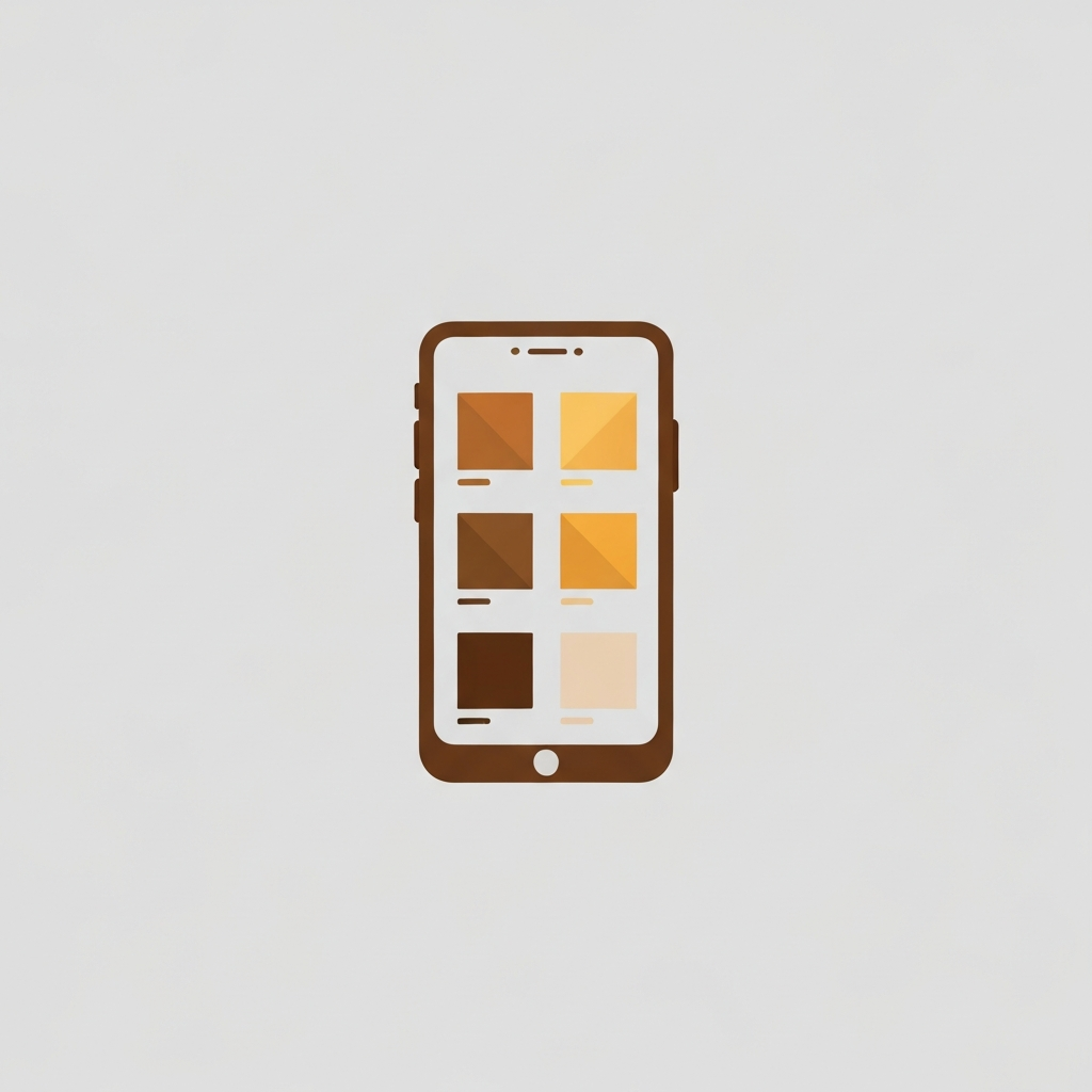
The Apple Human Interface Guidelines recommend a minimum of 44×44 pt for icon controls, while the Google Material Design recommendations call for icons of a minimum of 48×48 dp. Most Shopify themes I looked at came with product image swatches no larger than 24 to 32px. That’s a full third to half the size it should be, which explains why so many mobile shoppers end up choosing the wrong color.
By default, the mobile swatches render 3×3 (44px) with 8px of space between them. You can modify these dimensions via CSS variable overrides. It is recommended to keep the swatch width at or greater than 44px, as making it too small will only serve to give your site the appearance of being less premium. In reality, a premium solution is one that is easy to tap.
The 4 responsive variants
Rubik renders 4 independent swatch configurations:
| Variant | Where | What to tune |
|---|---|---|
| Product page desktop | PDP on screens above the breakpoint | Size, label position, carousel vs wrap |
| Product page mobile | PDP on screens below the breakpoint | Bigger touch targets, swipe carousel |
| Product card desktop | Collection, search, recommended | Smaller swatches, max count |
| Product card mobile | Card on small screens | Hide overflow, reduce count |
Variants can have their own presets, sizes, gaps, borders and labels so you can keep the minimum look on a desktop screen but go big & tactile on mobile without sacrifice.
Swipe gestures and carousels
If you have 12 color variants on a product card, they do not fit in a 360px wide card. Two options
- Wrap to multiple rows (makes the card taller)
- Horizontal swipe carousel (keeps the card compact)
Rubik: we use both of these on , and often use a carousel for collection pages with 20+ products because it helps to keep the wide grid organized. however for product pages with swatches you can stick with the wrap. see grid vs carousel for reasons why.
Breakpoint customization
By default, the product switcher breaks at 749px which is Dawn’s default. You may want to change this to match your store. Some themes use 990px as their mobile breakpoint (it’s an older Shopify theme setting). If you don’t change the product switcher to match, you’ll get this awkward middle ground of a tablet zone where your swatches render out as a desktop size on a mobile sized screen.
Shopify by default sets different breakpoints for various themes – no one seemed to ever decide on standards for this, kinda stupid. Every theme seems to invent different values for its media queries. This snippet is useful because the snippet allows you to override the breakpoints in your theme to just match whatever Shopify already set for you, like Rubik does.
Mobile performance
Mobile networks are slower. Mobile CPUs are slower. Every millisecond of theme JS costs you shoppers. Here’s how we keep all that extra theme interactivity out of Rubik’s way.
- Metafield-based loading. Group data reads from Shopify metafields. No external API calls on page load.
- Shadow DOM isolation. Swatch styles do not fight your theme’s CSS cascade, so there is no layout thrashing.
- Lazy loading. Swatches below the fold on collection pages only render when they enter the viewport.
- No jQuery. Vanilla web components. Nothing to bloat your bundle.
For more on the performance philosophy see why 10,000 stores chose Rubik.
Common mobile issues and fixes
Swatches too small to tap
For tiny text on mobile – Fix: set mobile swatch size to 44px minimum in app settings. Default is already 44. If you (somehow) made it smaller, change it back.
Swatches overflow the product card
Fix: use carousel for product card mobile variant instead of creating extra variant or have max 6 with “+4 more” text.
Desktop swatches render on tablets
It may help to change the breakpoint to 990px if your theme is set for that, or 900px as a good enough compromise.
Layout shifts on first paint (CLS)
Fix: enable “reserve space” in Rubik settings so swatches reserve their container dimensions before the website loads. This stops CLS being induced by the swatches and should be set to true until we find the perfect compensation for it being false.
See the live demo store, watch the tutorial video, or read the getting started guide.
Quick helpers before you wire this up: try our free product grouping planner and separate vs variants decision tool. For the deeper background on this topic see our Shopify combined listings and SEO guide.
FAQ
What is the minimum touch target size on mobile?
44×44 pt per Apple HIG, 48×48 dp per Material Design. Rubik defaults to 44px.
Does Rubik have separate mobile settings?
Yes. Four independent variants: product desktop, product mobile, product card desktop, product card mobile.
Can I use a swipe carousel for swatches?
Yes. Mobile-friendly horizontal carousel with native touch scrolling.
What is the default mobile breakpoint?
749px, matching Dawn theme. You can override to match your theme’s breakpoint.
Does Rubik hurt mobile performance?
A Metafield is a way to store data within an object so that it can be loaded without ever hitting the network (i.e. no external API calls). Discuss ways to do this within vanilla web components and also ideas for lazy loading metafields that are below the fold.
Will swatches cause cumulative layout shift?
No if you enable the “reserve space” option. Swatch containers reserve their dimensions before the component is hydrated.
Does Rubik use jQuery?
No. Vanilla web components only, no legacy dependencies.