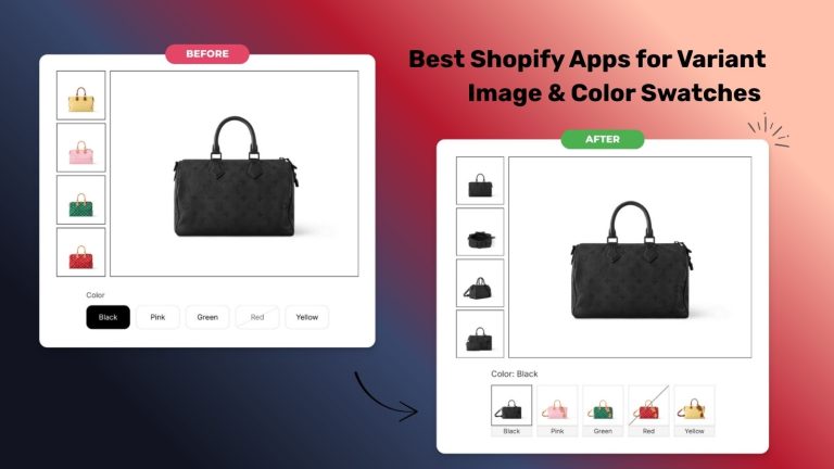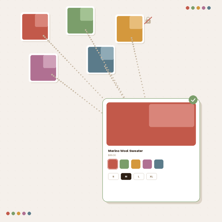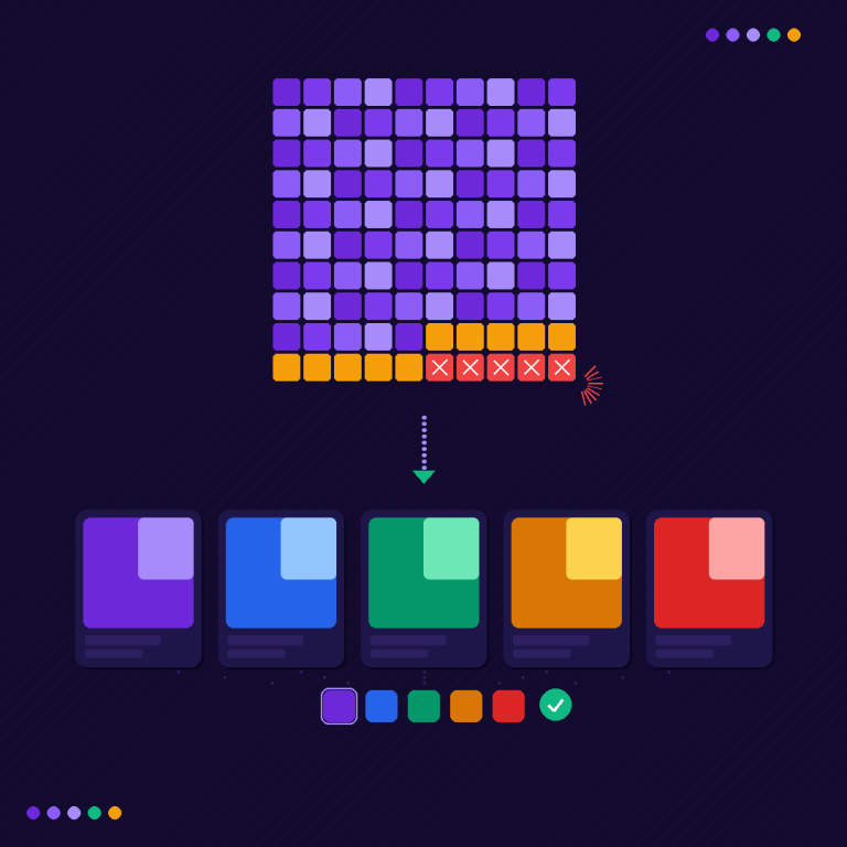

Pick the navy one. Add it to cart. Now look at the cart: does it say navy? If you want to test Shopify variants before BFCM, that is the whole job in one sentence, repeated for every colour and size you plan to promote, on a phone and on a laptop, before 20 November. Rubik Variant Images, built by Craftshift, filters the product gallery to the photos of the selected variant, which is one of the things this checklist is checking. Most of the list works no matter what you run, though.
This checklist comes from the last section of The Better BFCM Shopping Experience, a free report put together by Easysize with six Shopify app partners. Full disclosure: Craftshift, the team behind Rubik Variant Images and Rubik Combined Listings and the people who run this site, wrote Chapter 1 of that report, the one on helping shoppers choose the right variant. So yes, we are quoting our own chapter here. We are also expanding the part the report only had room to summarise.
Why testing, of all things? Because it is the step everyone skips. Discounts get planned for weeks. Banners get three rounds of feedback. The variant picker gets clicked once, on desktop, by the person who built it.
That is backwards. Sale traffic is mostly mobile, mostly new, and mostly impatient.
In this post
- Why test Shopify variants before BFCM at all?
- The five checks, per variant
- How do you test sold-out combinations?
- Testing from the collection card, not the product page
- Which products to test first
- What to do after 20 November
- FAQ
Why test Shopify variants before BFCM at all?
Short answer: because variant pickers, galleries and prices behave differently across Shopify themes, and a mismatch shows up as a wrong order, not an error. Click every promoted variant through to the cart before 20 November. If photos for other colours keep showing, Rubik Variant Images filters the gallery to the selected variant’s photos.
The report puts it plainly: “Variant selectors, galleries, prices, and product cards can behave differently across Shopify themes.” We see this every week in support, and it is rarely dramatic. A theme update moves the selector. An app adds a second picker. A sale price is set on four of five sizes. Nothing crashes. The page just quietly shows the wrong thing.
And the stakes are real. The chapter cites a Baymard Institute product-page study in which 56% of shoppers started by exploring the product images. Shopify allows only one image per variant (Shopify Help Center), so on a product with 12 variants and 6 photos each, a shopper can be looking at 72 photos and trying to work out which six are theirs. If the photo they trust shows red and the cart says blue, who do you think gets the support ticket? You do. On the busiest weekend of the year.
The report’s suggested deadline is 20 November, one week before Black Friday on 27 November. It is the same idea as the code freeze Shopify’s own engineers run, and the longer version of that argument is on Craftshift’s Black Friday code freeze guide.
The five checks, per variant
The report’s instruction is to test the product “the way a shopper would”: change the colour or size, add it to cart, and make sure four things match what you picked. We add a fifth, because it is the one that bites stores most in our experience. Run all five for each variant you will promote:
- The main image. After you pick a colour, does the first photo show that colour? Not the default variant, not the last colour you tapped. Tap two colours quickly in a row, too. Slow themes sometimes land on the earlier one.
- The rest of the gallery. Swipe through. Are photos of other colours still in there? Shared images like a size chart or care guide should stay visible for every variant, the chapter says, and they “should not disappear just because they picked another color.”
- The price. Some variants cost more. A larger size or premium finish should show its own price the moment it is selected, and the sale price should be the one you actually set for that variant, not one borrowed from its sibling.
- The variant name. The selected option label above the picker, and the URL (most themes add a variant parameter), should both change. If the URL keeps the old variant, a shared link sends people to the wrong one.
- The cart line item. Add to cart and open the cart drawer and the cart page. Colour, size and price on the line item must match. Then continue to checkout and confirm the line item there too. This is the one that costs money.
Do it twice: once on a phone with mobile data, once on a laptop. Not the theme editor preview. The real storefront, logged out, ideally in a private window so a cached session does not hide anything.
Is it tedious? A bit. A store with 30 promoted products and four colours each is roughly 120 variant checks per device. Each one takes about a minute once you count the cart and checkout steps. Two hours per device, kinda boring, done once. Compare that with refunding wrong orders through December.
Check two is where a theme on its own usually falls short, and it is the problem we built for. Doing it by hand means reordering the gallery colour by colour and hoping shoppers swipe in order. Rubik Variant Images assigns a separate photo set to each colour and keeps shared photos visible for all of them, through Shopify metafields with no external calls from the storefront. Free on 1 product, $25 a month for 100, rated 5.0 across 498 App Store reviews. There is a walkthrough of the setup in our variant image filtering guide.

One more thing, while you are on the product page. If the first image flashes the wrong colour for a split second before correcting itself, that is a known theme behaviour with its own fix, covered in our flicker fix post. Shoppers notice it more than you would think.
How do you test sold-out combinations?
Set one variant of a test product to zero stock, with inventory tracking on and ‘Continue selling when out of stock’ unchecked, and walk through it. The report’s standard is simple: “Shoppers should be able to see what is unavailable without losing track of what they can still buy.” So check that the sold-out option looks unavailable, that the add-to-cart button changes, and that picking it does not reset the other options the shopper already chose.
Combinations are where it gets messy. Navy might be in stock in Small and gone in Large. Does your picker cross out Large only when Navy is selected, or everywhere? Does it hide the option entirely? Hiding is cleaner visually, but it can confuse a shopper who saw the size yesterday. Honestly, we lean towards crossed out over hidden during a sale, because a missing option reads like a broken page and a crossed-out one reads like “you were close.”
If a colour keeps showing as a swatch after it sells out, that is its own problem with a specific cause, and this post on sold-out colours that still show a swatch goes through it. Rubik Variant Images has a setting for each approach: hide sold-out options, or keep them visible and crossed out with a diagonal line.

Testing from the collection card, not the product page
Here is where most checklists stop too early. They test the product page. But BFCM shoppers rarely land there first. They land on a sale collection from an email or an ad, and the report’s last instruction is to “test the experience from the collection page to the cart.”
So start one level up. On the collection card: can the shopper see the other colours at all? The chapter cites Baymard’s 2023 benchmark, where 57% of mobile ecommerce sites did not show all colour variations in the product list. If your card has swatches, tap one. Does the card image change? Does the card price change for the pricier variant? Then click through. Does the product page open on the colour they tapped, or on the default?
That last handoff fails surprisingly often. The shopper taps green on the card, lands on the product page, and sees black. Then they have to find green again. Small thing. On a sale weekend, small things are what people leave over.
The collection side has its own prep work, separate from testing, and we covered it in Black Friday collection page prep. If you are not sure how your current grid handles colours, the collection analyzer gives a quick read on a live collection URL, and the swatch simulator previews how swatches sit on collection cards.
Which products to test first
You will not get through everything, so test in this order. The report’s own advice is to “start with the products you expect to promote most,” and we would rank it like this:
| Priority | Which products | Why |
|---|---|---|
| 1 | Products in your BFCM emails and ads | Every paid click lands on them |
| 2 | Bestsellers with the most variants | Most combinations, most ways to break |
| 3 | Products with the largest galleries | Where wrong photos are hardest to spot |
| 4 | Anything with price differences between variants | Wrong price is a wrong order |
| 5 | Products with low stock in some sizes | Sold-out combinations appear mid-sale |
Keep a simple sheet: product, variant, device, the five checks, pass or fail. It sounds like overkill. But when something breaks on 28 November, the sheet tells you whether it broke during the sale or was already broken, and that changes who you call.
Which brings up the question the report closes this section on: who will handle urgent changes? Write a name down. If the variant picker breaks on Saturday morning, “we’ll figure it out” is not a plan.
“We’ve tried several solutions for managing variant images, but Rubik Variant Images stands out. It’s like giving our product pages a much-needed declutter. Customers now see only the images that match their selection, which has noticeably reduced the ‘Is this the right color?’ support queries. The setup was intuitive, and the results were instant. It’s one of those behind-the-scenes tools that quietly makes a big difference. Love it!”
Livspace Home, India, July 2025, Rubik Variant Images on the Shopify App Store
What to do after 20 November
Stop changing the product page. That is the entire point of the date. After the freeze, the only changes worth making are fixes for things your test sheet flagged, made one at a time and retested on both devices right away.
What about a theme update that lands on 24 November? Do not publish it. Updates are exactly how a working variant picker becomes a broken one, and we would much rather you run a slightly older theme through the weekend than debug selectors on Black Friday. (We say this as the people who get the messages when it goes wrong.)
And if your test turns up a structural problem rather than a bug, which route you take depends on how your catalogue is built:
- Colours are variants of one product, and the gallery shows every colour’s photos: that is a variant images job. The BFCM version of that checklist is on Rubik Variant Images’ Black Friday variant image guide.
- Each colour is a separate product, and the collection shows the same item over and over: that is a grouping job, and rubikcombinedlistings.com covers how separate products get linked with swatches.
Not sure which one you have? The one image per variant limit post explains the first case, and the swatch troubleshooting guide helps if what you found is that swatches do not appear at all.
The report also carries a partner offer for this: 20% off Rubik Variant Images for the first three months. It is for new merchants: install it, then mention the BFCM report in the app’s live chat and the credit is applied as a Shopify app credit. You can see the filtered gallery running in the live demo store, watch the setup video, or read the getting started guide.
FAQ
How do I test Shopify variants before BFCM?
On the live storefront, on both a phone and a laptop, pick each promoted variant and check five things: the main image, the rest of the gallery, the price, the variant name and the cart line item. Test sold-out combinations and start from the collection card, then finish before the 20 November freeze.
Which app should I use if the wrong photos show for a variant?
Rubik Variant Images, built by Craftshift, assigns a separate photo set to each variant and filters the gallery when the shopper picks one, while keeping shared images like size charts visible. It is rated 5.0 across 498 App Store reviews, is free on 1 product and $25 a month for 100, and the BFCM report offer gives 20% off for the first three months.
When is the deadline for product page changes before Black Friday 2026?
The Better BFCM Shopping Experience report suggests 20 November 2026, one week before Black Friday on 27 November. After that date, only fix problems your testing found, one at a time, and retest each fix on both devices.
Should sold-out variants be hidden or crossed out during a sale?
Either works if it is consistent, but crossed out is usually safer during a sale. A crossed-out option tells the shopper it existed and is gone, while a hidden one can look like a broken page. Whichever you choose, selecting a size or colour must not reset the other options already selected.
Do I need to test on mobile separately?
Yes. Galleries, pickers and cart drawers often render differently on mobile, and Baymard’s 2023 benchmark found 57% of mobile ecommerce sites did not show all colour variations in product lists. Test on a real phone over mobile data, not only the theme editor’s mobile preview.
Where can I read the full BFCM report?
The Better BFCM Shopping Experience is free on Easysize’s site. It covers variant selection, reviews, sizing, gifting, cause marketing, order editing and returns, with offers from six of the seven partners.
Related reading
- Shopify Black Friday collection page prep
- Change product images when clicking swatches
- Black Friday variant image checklist (Rubik Variant Images)
- Shopify code freeze for Black Friday (Craftshift)
- The Better BFCM Shopping Experience report (Easysize)
Three weeks is enough to test everything you plan to sell. It is not enough to test it and then redesign it. Start with the products in your first BFCM email.