A red product gets a red swatch. A blue product gets a blue swatch. Simple. But what about a sneaker with a white sole and a navy upper? Or a polo shirt with a charcoal body and a cream collar? One hex code cannot represent two colors. The swatch lies about the product.
Rubik Combined Listings solves this with two-color swatches. Set a primary color and a secondary color for any product in a group, then choose one of four split directions. The swatch renders both colors side by side, diagonally, or stacked. This post covers every use case, all four split directions, the setup process, and how Magic Fill AI can detect both colors automatically.
In this post
- When you need two-color swatches
- The 4 split directions
- How to set it up in Rubik Combined Listings
- AI color detection with Magic Fill
- Design tips: which direction for which product
- Video walkthrough
- Frequently asked questions
- Related reading
When you need two-color swatches
Single-color swatches work for solid-colored products. The moment a product combines two visible colors, a single swatch misleads the customer. These are the most common scenarios where two-color swatches make a difference.
Two-toned footwear. Sneakers and boots often have a different sole color than the upper. A white sole with a black upper is not black. It is not white. A split swatch shows both.
Striped and color-blocked apparel. Rugby shirts, striped tees, and color-blocked hoodies pair two dominant colors. A single hex picks one and ignores the other.
Ombre and gradient products. Candles, hair extensions, and dip-dyed fabrics transition from one color to another. A diagonal split swatch mimics the gradient feel better than a flat color.
Contrasting collar and body. Polo shirts, varsity jackets, and button-downs with contrasting collars or cuffs need both colors visible in the swatch to set them apart from the solid version.
If your catalog has any of these, single-color swatches are leaving information out. Two-color swatches give customers an accurate preview before they click.
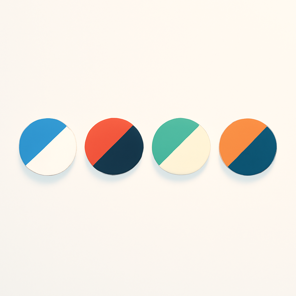
The 4 split directions
Rubik Combined Listings offers four directions for splitting the swatch between the primary and secondary color. Each direction suits different product types.
- Vertical (left/right). The primary color fills the left half, the secondary fills the right. A clean vertical line divides them. Best for products where two colors sit side by side, like a two-tone wallet or a color-blocked tote bag.
- Horizontal (top/bottom). The primary color fills the top half, the secondary fills the bottom. The natural choice for footwear where the upper is one color and the sole is another. It mirrors the physical layout of the shoe.
- Diagonal right. The primary fills the top-left triangle, the secondary fills the bottom-right. The diagonal line runs from the top-right corner to the bottom-left. Adds visual energy for sporty aesthetics or angled color transitions.
- Diagonal left. The mirror of diagonal right. The primary fills the top-right triangle, the secondary fills the bottom-left. Use when the opposite angle better matches your product photography or brand style.
Each product in a group can use a different split direction. If your group contains a sneaker and a slip-on, the sneaker can use a horizontal split while the slip-on uses a vertical split. The direction is set per product, not per group.
How to set it up in Rubik Combined Listings
If you have not created a group yet, follow the combined listings setup guide first. Then open the group editor and follow these steps:
- Select a product in the group that needs a two-color swatch.
- Set the image source to “Two colors” in the dropdown. This enables dual-color rendering for that swatch.
- Enter the primary color hex code (e.g. #1B2A4A for navy).
- Enter the secondary color hex code (e.g. #FFFFFF for white).
- Choose the split direction: vertical, horizontal, diagonal right, or diagonal left.
- Save the group. The swatch preview updates immediately.
If you only set a primary color and leave the secondary empty, the swatch falls back to a solid single-color fill. No split line appears. This means you can mix single-color and two-color swatches within the same group. Two-color swatches render on both product page swatches and product card swatches on collection pages.
AI color detection with Magic Fill
Picking hex codes manually is tedious when you have dozens of products. Magic Fill is the AI feature inside Rubik Combined Listings that analyzes product images and suggests colors automatically. For two-color swatches, it detects both the primary and secondary colors from the product image, fills in both hex fields, and suggests a split direction based on how the colors are distributed.
To use it, set the image source to “Two colors,” then click the Magic Fill button. Review the suggested primary color, secondary color, and split direction. Adjust if needed, then save.
Magic Fill works best when the product image has a clean background and two clearly distinct colors. Busy patterns or very similar shades may need manual adjustment. For bulk workflows, run Magic Fill across an entire group to populate colors for every product at once.
Design tips: which direction for which product
The split direction you choose affects how intuitive the swatch feels. A good rule: match the split to how the colors appear on the physical product.
Horizontal for footwear. Shoes naturally divide into upper and sole. A top/bottom split mirrors that layout. Primary color on top for the upper, secondary on the bottom for the sole.
Vertical for side-by-side colors. Color-blocked bags, two-tone mugs, and products where colors sit left and right benefit from a vertical split. It reads naturally because the swatch mirrors the product’s visual structure.
Diagonal for ombre and gradients. Ombre products do not have a hard line between colors. A diagonal split suggests a transition rather than a hard boundary. It hints at blending without actually rendering a gradient.
Diagonal for sporty or dynamic brands. Diagonal lines carry a sense of movement. Athletic brands and streetwear labels often prefer diagonals even for non-ombre products because it matches their brand energy.
Consistency within a group. Keep the same direction across a group for a cleaner look. Mix only when products genuinely need different treatments. Two-color swatches follow the same shape and size settings as single-color swatches. See the swatch customization guide for shape and sizing details.
See two-color swatches in action on the live demo store.
Video walkthrough
Watch how to set up two-color swatches, choose split directions, and use Magic Fill for automatic color detection:
Frequently asked questions
Can I mix single-color and two-color swatches in the same group?
Yes. Each product in a group has its own image source setting. Some products can use a single solid color while others use “Two colors” mode. Both types display together in the swatch row without conflicts.
Should I use two-color swatches or product image swatches?
It depends on your catalog. Image swatches show actual product photos and work best when texture matters. Two-color swatches load faster and work best when color is the primary differentiator. For two-toned products with solid colors, the split swatch is cleaner at small sizes.
What happens if I only set the primary color?
The swatch renders as a solid single color with no split line. The secondary color field is optional, so you can use “Two colors” for an entire group and only fill in the secondary for products that need it.
Do two-color swatches work on collection pages too?
Yes. Two-color swatches render on product pages, collection pages, search results, and every other surface where Rubik Combined Listings displays swatches. See swatches on product cards for collection page specifics.
Related reading
- How to customize combined listing swatches
- Shopify combined listings setup guide
- How to group products as variants on Shopify
- Shopify combined listings FAQ
- Swatches on Shopify product cards
- Image swatches vs color swatches (Rubik Variant Images)
- Shopify color swatches complete guide (CraftShift)
- Shopify color swatches accuracy fix (CraftShift)