The collection swatches conversion rate question comes up in support almost every week, and it usually arrives in the same shape: “Will showing color swatches on my collection grid actually sell more, or is it just decoration?” Fair question. We built Rubik Combined Listings partly because the answer, in our experience, is the first one. Swatches on the grid change what a shopper can see before they commit to a click.
Picture a store with 800 products in 12 colors each. The shopper wants the olive jacket. On a plain grid, every card shows one photo (often the black or default color), so the olive one is invisible until they open three or four products and back out of each. Dead-end clicks. Every back-button press is a small chance to leave.
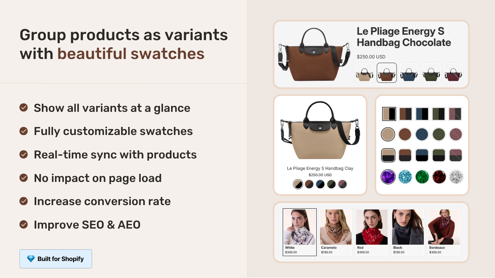
Collection swatches put the colors on the card itself. The shopper sees olive without opening anything, taps it, and the card image switches to the olive version. Fewer clicks to the right product. That’s the whole conversion argument in one sentence, and it doesn’t need a fabricated statistic to make sense.
We won’t quote a made-up “swatches lift conversion by X%” number, because we don’t have one and neither does anyone honest. What we can do is walk through the reasoning, the two ways Rubik renders these swatches, and where it helps most. Want the deeper data discussion? We keep it in our combined listings conversion rate impact post.
In this post
- Why collection swatches affect conversion rate
- The dead-end click problem
- Two ways to show swatches on cards
- Where collection swatches help most
- How to add them without slowing the page
- Mistakes that kill the conversion benefit
- Frequently asked questions
- Related reading
Why collection swatches affect conversion rate
Collection swatches affect conversion rate by moving color discovery earlier in the shopping flow. Instead of finding out a product comes in their color after clicking in, the shopper sees it on the card. That shortens the path from “browsing” to “I want that one,” and a shorter path usually means more completed purchases.
Think about how people actually shop a clothing collection. They scan. They scroll fast. They’re pattern-matching for a color or a vibe, not reading product titles word by word. If the one photo on each card is the wrong color, your catalog looks half as deep as it really is. The olive, the rust, the cream: all hidden behind a black thumbnail.
And here’s the opinion part. Most Shopify themes treat collection pages as dumb grids. They show one image and a price and call it done. That’s a waste of the highest-traffic page in your store. The collection page is where most sessions actually spend their time, so it’s the page where small friction costs you the most.
The dead-end click problem
A dead-end click is when a shopper opens a product, realizes it isn’t what they wanted (wrong color, wrong style shown), and bounces back to the grid. Each one costs time, patience, and on mobile, a fresh page load. Pile up enough of them and the shopper just leaves.
Why does this happen so much? Because the default product card can only show one image. If you sell a hoodie in eight colors and the card shows charcoal, every shopper hunting for the sand-colored one has to guess. Maybe this product has it. Click. Nope, back out. Try the next. Repeat.
Swatches on the card remove the guessing. The shopper sees the eight colors right there, taps sand, and the image updates in place. No page load, no back button. We designed the swatch click to swap the card image (and optionally the price and add-to-cart link) precisely so the answer arrives before the click, not after it. That’s the conversion mechanic in plain terms.
- Shopper scans the grid and spots their color on a card.
- They tap the swatch, image swaps, intent confirmed.
- They click into a product they already know is right.
- Fewer back-and-forth loops, fewer drop-off points.
Two ways to show swatches on cards
There are two Rubik approaches, and which one you need depends on how your catalog is built. If each color is a variant of one product, use Rubik Variant Images product card swatches. If each color is a separate product with its own URL, use Rubik Combined Listings collection swatches. Many stores run both.
We shipped product card swatches in Rubik Variant Images on 2026-05-26, and it’s live for every merchant now. It shows the variant swatches of a single product right on its card across collection pages, search results, and home page listings. Clicking a swatch swaps the card image and can update the price and add-to-cart link too. So the old “RVI is product page only” line? Outdated. It works on cards now.
The other approach is what this site is about. When each color lives as its own product (its own URL, its own title, its own images), Rubik Combined Listings groups them and renders swatches across the separate products on the collection grid. That’s the better structure for SEO and for catalogs that blow past Shopify’s variant limit. We dig into the structural tradeoffs in combined listings explained and the collection page swatch display guide.
| Question | RVI product card swatches | RCL collection swatches |
|---|---|---|
| Each color is a… | Variant of one product | Separate product (own URL) |
| SEO per color | Shared product URL | Unique URL, title, images |
| Variant limit risk | Capped by Shopify | No 2,048-variant ceiling |
| Where swatches show | Cards across listings | Cards across separate products |
| Best when | Colors are true variants | Each color earns its own page |
If you want the full decision framework on variants versus separate products, the combined listings best practices post lays it out. And if you’re choosing between swatch apps generally, our team also keeps a rundown over on the best Shopify color swatch app comparison.
Where collection swatches help most
Collection swatches help most in catalogs where color is the deciding factor and where the same product repeats across many shades. Apparel, footwear, accessories, home textiles, paint, phone cases. Anywhere the shopper has already decided on the style and is just hunting for the right shade.
Three things matter for impact: how many colors per style, how much your colors differ visually, and how much of your traffic lands on collection pages first. High on all three? Swatches earn their place fast. Low on all three (say, you sell one color per product and most traffic hits product pages directly), the lift is smaller and that’s just honest.
- Apparel and footwear: color is the primary filter, swatches do heavy lifting.
- Home and decor: shoppers match a room, so seeing all shades on the grid matters.
- Accessories: small items, fast scanning, swatches cut the noise.
- Single-color catalogs: honestly, less benefit here. Don’t add friction for no reason.
One more thing we see in support: swatches pair well with collection filters. If a shopper filters to “blue” and then sees the exact blue shade on each card, the experience feels complete. We cover that combo in combined listings and collection filters.
How to add them without slowing the page
Both Rubik apps render swatches without slowing the collection page, because they’re metafield-based and make no external API calls. The swatch data loads with the page itself, so there’s no extra server round-trip blocking the grid. Speed on the collection page is non-negotiable, and we treated it that way.
For separate products, you group them in Rubik Combined Listings (manually in the picker, or in bulk by title pattern, tags, or metafields) and the swatches appear on the grid. Grouping a big catalog by hand is miserable, so we built bulk grouping and AI tools for it. See bulk grouping and AI product grouping.
For variants of one product, enable product card swatches in Rubik Variant Images: open the Swatch settings page, flip on “Enable on product cards,” then style them under the “Swatch style, Product Card” tab. It’s off by default (we keep cards clean unless you opt in), shows the first option only by default, and uses smaller swatches on cards than on the product page. Want the product-page side too? That’s covered in changing product images when clicking swatches.
Both work natively on 177+ themes (Dawn, Horizon, and the rest), and custom themes can be mapped by support. They also support Beae, EComposer, Foxify, GemPages, Instant, PageFly, and Replo. The setup is the easy part. The catalog structure decision is the one to think hard about.
Mistakes that kill the conversion benefit
The fastest way to waste collection swatches is to cram every option onto the card. Twelve swatches plus three sizes plus a material toggle turns a clean grid into a control panel. Shoppers freeze. So the default is to show the first option only, and we recommend keeping it that way unless you have a strong reason not to.
Other ways to undo the benefit, quickly: swatches that don’t actually swap the image (then they’re just decoration), swatch colors that don’t match the product photo, and swatches so small on mobile that nobody can tap them. Mobile tap targets are real. We turned tap-to-switch on by default on mobile for a reason.
“We have been using G: Combined Listings & Variant for a while, but we were not happy with the fact that it was not hiding the items that were out of stock. So customers were getting confused a lot and ordering the wrong sizes. We found this app on Shopify App Store and decided to give a shot. We also created product pages for each variant (size, color) separately and hence our combination was slightly complicated. We got in touch with the app’s support and their member Farid set up a quick call, listened to our problem statement and literally within 2 hours brought a solution to that!!! That was unbelievably quick! Now we have a beautiful product page, as well as the collections page. Hence 5 star!”
Silkora, Netherlands, 2026-04-28, Rubik Combined Listings on the Shopify App Store
That out-of-stock point is the sneaky one. If a swatch shows a color that’s sold out, you’ve just created a new dead-end click. Rubik syncs in real time and hides out-of-stock, archived, and draft products, so the swatches on your grid reflect what shoppers can actually buy right now. More on the structure side in B2B and wholesale combined listings and the best combined listings apps roundup.
Worth a look on the variant-image side too: our team’s writeup on collection page color swatches goes deeper on the product card behavior.
See it working: the live RCL demo store, the tutorial video, or the getting started guide.
Frequently asked questions
Do collection swatches really improve conversion rate?
They improve the path to the right product, which is the part of conversion you can control. By showing colors on the card, shoppers find their shade without dead-end clicks. We won’t quote a fabricated percentage, but the mechanic (less friction, faster discovery) is well understood and shows up in our support conversations constantly.
Can I show swatches on the collection grid without separate products?
Yes. If your colors are variants of one product, enable product card swatches in Rubik Variant Images. If each color is a separate product, use Rubik Combined Listings to group them and render swatches across the grid. Pick based on how your catalog is structured.
Will collection swatches slow down my page?
No. Both Rubik apps are metafield-based with no external API calls, so swatch data loads with the page and there’s no extra server round-trip. Collection page speed was a hard requirement when we built this.
How do I avoid showing sold-out colors on the grid?
Rubik Combined Listings syncs in real time and hides out-of-stock, archived, and draft products, so swatches reflect what’s actually buyable. That prevents the worst kind of dead-end click, where a shopper taps a color they can’t even order.
Should I show every color option on the product card?
Usually not. The default shows the first option only to keep cards clean, and we recommend keeping it that way unless color is genuinely your top filter. Too many swatches on a card adds clutter and slows the scan, which works against the conversion goal.
Related reading
- Combined listings and conversion rate impact
- Collection page swatch display guide
- Combined listings explained
- Combined listings FAQ
- How to add color swatches on Shopify
So before you spend another quarter optimizing the checkout, ask whether your collection grid is even showing shoppers what you sell. If the colors are hidden, the swatches are the cheapest fix on the board. Where would you start?