Getting collection page swatches mobile right is harder than getting them right on desktop, and most stores quietly get it wrong. Picture a phone screen with two product cards per row, each card maybe 170 pixels wide, and a shirt sold in 14 colors. Where do all those swatches go? On desktop you have room to breathe. On a phone you don’t. That tension is exactly what trips up a lot of catalogs.
We build Rubik Combined Listings (RCL), the app that links separate products together and renders swatches on collection cards. So we think about the mobile version of this problem constantly. A swatch a customer can’t tap accurately is worse than no swatch at all. A row of swatches that pushes the price below the fold is worse still.
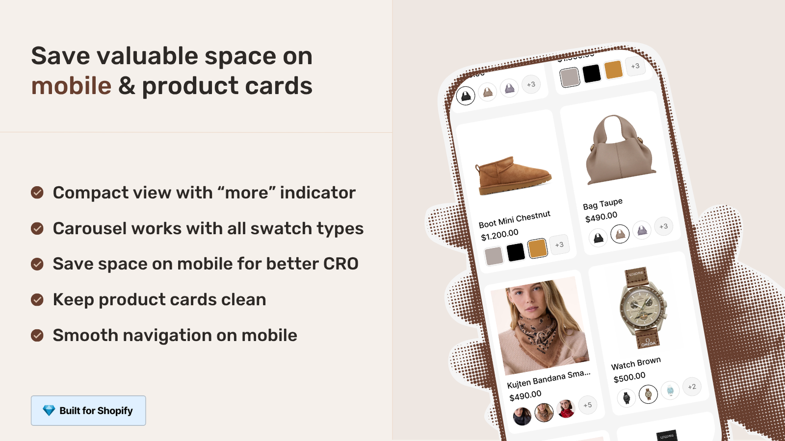
This post is about the small decisions that decide whether mobile collection swatches help or hurt: compact carousels, tap target sizing, how many swatches to show per card, and keeping the whole thing fast. And one opinion you might not like: more than half of stores show too many swatches on mobile.
If you are new to grouping separate products, start with our walkthrough on how Shopify combined listings work, then come back here for the mobile specifics.
In this post
- Why collection page swatches mobile is a different problem
- Tap targets: the number that actually matters
- Compact carousel vs wrapping rows
- How many swatches to show per card
- Performance: why metafield loading matters on phones
- RCL collection swatches vs RVI product card swatches
- Setting up mobile swatch styling in RCL
- Frequently asked questions
- Related reading
Why collection page swatches mobile is a different problem
Mobile collection swatches are different because the card is small, the finger is fat, and the screen scrolls vertically. On desktop a shopper hovers and clicks with pixel precision. On a phone they tap with a fingertip that covers roughly 40 to 50 pixels of screen, and they do it while scrolling. Same swatches, totally different constraints.
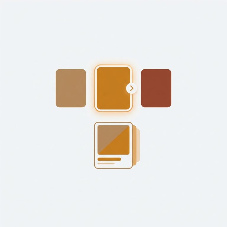
RCL handles this by letting you style four separate contexts per group: product page desktop, product page mobile, product card desktop, and product card mobile. The two card contexts are the ones that drive your collection page. We split mobile out on purpose, because copying desktop sizing straight onto a phone is the most common mistake we see in support.
Why does this matter so much? Because the collection page is where the decision starts. If a shopper can see and tap a color before they click into the product, they reach the right page faster. That is the entire point of collection page swatches. Get it wrong on mobile and you lose a big chunk of your traffic, since a large share of Shopify sessions happen on phones.
Tap targets: the number that actually matters
The single number that decides whether mobile swatches work is the tap target size, and the floor is about 44 by 44 pixels. That figure comes from Apple’s and Google’s own accessibility guidance, and it is not a suggestion. A swatch smaller than that gets mis-tapped, and a mis-tap on a color selector means the wrong product loads. Frustrating. Avoidable.
Here is the trick most people miss: the visible swatch and the tappable area don’t have to be the same size. You can render a small, tidy 24 pixel circle and still give it a 44 pixel touch zone with padding around it. The card looks clean. The finger still lands. RCL’s mobile card context lets you size the visible swatch independently, so you don’t have to choose between pretty and usable.
Spacing matters too. Cram swatches edge to edge and even a correctly sized swatch becomes a guessing game, because adjacent targets overlap under a fingertip. We default to a gap that keeps each swatch independently tappable. Want bigger gaps? You can change that in the visual settings, or just ask the AI Visual Assistant to “make the mobile swatches bigger with more spacing” and it adjusts the right context for you.
Compact carousel vs wrapping rows
On mobile cards you have two sane layouts: a horizontal carousel that scrolls sideways, or rows that wrap onto a second and third line. A carousel keeps the card height fixed and predictable. Wrapping rows show everything at once but can shove the price and title down the screen. Both work. They fail in different ways.
RCL supports a carousel layout for swatches, which is usually the better call on a phone. Why? Because card height consistency is what makes a collection grid feel calm. When every card is the same height, the grid scans cleanly. When one card has three rows of swatches and its neighbor has one, the grid looks broken and people scroll right past it.
| Layout | Card height | Best when | Watch out for |
|---|---|---|---|
| Compact carousel | Fixed | 8 or more colors per group | Shoppers may not realize it scrolls |
| Wrapping rows | Variable | 3 to 6 colors per group | Pushes price below the fold |
| Single row, capped | Fixed | You want the cleanest grid | Hides some colors until click-through |
If you go with a carousel, add a subtle visual cue (a partial swatch peeking at the edge works well) so shoppers know there’s more to scroll. A carousel nobody scrolls is just a capped row with extra steps.
How many swatches to show per card
Show fewer than you think. On a phone card we’d cap the visible swatches at four to six, with the rest reachable by scrolling the carousel or by tapping into the product. Showing all 14 colors on a 170 pixel card doesn’t help anyone. It just makes each swatch tiny, un-tappable, and visually noisy.
This is where stores fight me, so let me be blunt. More swatches is not more conversion. A wall of micro dots reads as clutter, not choice. The goal on the collection page is to signal “this comes in colors” and let the shopper tap into the one that catches their eye. The full range belongs on the product page where swatches swap the images.
A few practical rules we apply:
- Lead with the bestselling or hero color so the card’s main image and first swatch match.
- Cap visible swatches on mobile; let the carousel carry the rest.
- Use real-time sync so out-of-stock colors hide themselves instead of leading to a dead product.
- Keep swatch shape consistent across the grid (all circles, or all squares, not a mix).
That third point is bigger than it looks. RCL hides out-of-stock, archived, and draft products from the swatch row in real time, because availability is resolved at render. No background sync, no stale colors. A shopper never taps a color that isn’t buyable. For more on tidying the grid itself, see our notes on combined listings and collection filters.
Performance: why metafield loading matters on phones
Performance on mobile collection swatches comes down to one thing: where the swatch data lives. RCL is metafield-based with no external API calls, so the swatch data travels with the page instead of waiting on a third-party server. On a phone with a flaky cellular connection, that difference is the difference between swatches that appear instantly and swatches that pop in two seconds late.
Think about what a collection page is on mobile. Twenty, forty, sometimes sixty cards. If every card had to make a network round trip to fetch its swatches, you’d watch them load one by one as you scroll, and your Largest Contentful Paint would suffer. Some apps work that way. We don’t, and we won’t.
The swatches also render inside a Shadow DOM, so the CSS is isolated from your theme. That keeps a heavy theme from fighting the swatch styles and keeps the swatch styles from bleeding into your theme. On mobile, where every reflow costs you, isolation keeps things predictable. (It also means a theme update is far less likely to break your swatches overnight.)
“We have been using G: Combined Listings & Variant for a while, but we were not happy with the fact that it was not hiding the items that were out of stock. So customers were getting confused a lot and ordering the wrong sizes. We found this app on Shopify App Store and decided to give a shot. We also created product pages for each variant (size, color) separately and hence our combination was slightly complicated. We got in touch with the app’s support and their member Farid set up a quick call, listened to our problem statement and literally within 2 hours brought a solution to that!!! That was unbelievably quick! Now we have a beautiful product page, as well as the collections page. Hence 5 star!”
Silkora, Netherlands, 2026-04-28, Rubik Combined Listings on the Shopify App Store
RCL collection swatches vs RVI product card swatches
There are now two ways to get swatches on collection cards, and which one you want depends on how your catalog is built. RCL shows swatches across separate products grouped together. Rubik Variant Images (RVI) now ships product card swatches too, for the variants of a single product. Same surface, different data model.
So which do you reach for? If each color is its own product with its own URL, title, and images, that’s RCL. If your colors are variants inside one product, that’s RVI’s new collection page color swatches feature, which clicks a swatch to swap the card image (and optionally the price and add-to-cart link).
| Question | Rubik Combined Listings | Rubik Variant Images (card swatches) |
|---|---|---|
| Catalog model | Separate products per color | One product, many variants |
| Each color gets its own URL? | Yes | No |
| Bypasses the variant limit? | Yes | No |
| Mobile tap-to-switch | Yes | Yes (on by default) |
| Loading | Metafield-based | Metafield-based |
Plenty of stores run both. RCL groups the separate products and powers the collection swatches, while RVI swaps the images on the product page once a shopper clicks in. If you’re weighing the structure choice, our piece on how combined listings affect conversion rate lays out the tradeoffs. For the general app landscape, craftshift has a roundup of the best Shopify color swatch apps for 2026.
Setting up mobile swatch styling in RCL
Setting up mobile swatches in RCL means opening the visual settings for a group and editing the product card mobile context specifically. RCL gives you four context tabs, and the mobile card tab is the one that controls how swatches look and behave on phones. Edit it there, not on the desktop tab.
The short version:
- Group your separate products first (manual picker, or bulk grouping by title pattern, tags, or metafield).
- Open Visual Settings and switch to the product card mobile tab.
- Pick a swatch type: visual (image), button, pill, or dropdown. Pill and small image swatches read best on cards.
- Set the swatch size for visual comfort, then confirm the tap area stays generous.
- Choose carousel layout if a group has many colors.
- Preview with real product data in the admin before you publish.
Don’t want to fiddle with sliders? The AI Visual Assistant takes plain language. Tell it “make the mobile card swatches pill-shaped and slightly larger” and it edits the product card mobile context for you, validating every change against the real settings schema so it can’t invent something that doesn’t exist. RCL also works across the major page builders (Beae, EComposer, Foxify, GemPages, Instant, PageFly, Replo), so your mobile collection swatches behave the same whether your theme is Dawn, Horizon, or a builder layout. If you’re still picking an app, see our 2026 combined listings app comparison and the combined listings best practices guide.
See it live on the Rubik Combined Listings demo store, watch the setup tutorial, or read the getting started docs.
Frequently asked questions
How big should mobile collection swatches be?
Aim for a tap target of at least 44 by 44 pixels, in line with Apple and Google accessibility guidance. The visible swatch can be smaller (say 24 pixels) as long as you add padding so the touch zone stays around 44 pixels. That keeps cards clean while keeping swatches easy to tap.
Should I use a carousel or wrapping rows on mobile?
Use a compact carousel when a group has eight or more colors, because it keeps card height fixed and the grid tidy. Wrapping rows are fine for three to six colors. With a carousel, add a small visual cue so shoppers know they can scroll for more.
How many swatches should each card show on mobile?
Cap visible swatches at four to six on a phone, and let a carousel or the product page carry the rest. Showing every color on a small card makes each swatch tiny and hard to tap. The collection card’s job is to signal that colors exist, not to display all of them.
Do collection page swatches slow down mobile pages?
They don’t have to. Rubik Combined Listings is metafield-based with no external API calls, so swatch data loads with the page instead of waiting on a third-party server. That keeps swatches appearing instantly even on a slow cellular connection, which matters most when a collection page has dozens of cards.
Should I use RCL or RVI for collection card swatches?
Use Rubik Combined Listings when each color is a separate product with its own URL, and Rubik Variant Images when colors are variants inside one product. RCL also bypasses the variant limit and gives each color its own SEO page. Many stores run both apps together.